Behind the Screens: Accessible Design Is Good Design
Explore how Atlassian integrates accessibility into its Design System, ensuring all applications are inclusive by default. Learn about their principles, practices, and how a focus on accessibility enhances usability, reduces rework, and elevates product quality for everyone.
Accessibility is not a separate design track; it is fundamental to design quality. This understanding has led Atlassian to integrate accessibility into every level of its Design System, ensuring all applications are inclusive by default. By embedding accessibility as a core design principle rather than a compliance afterthought, foundations, tokens, and components inherently meet accessibility standards. This approach reduces rework, enhances usability, and elevates the overall quality of Atlassian applications.
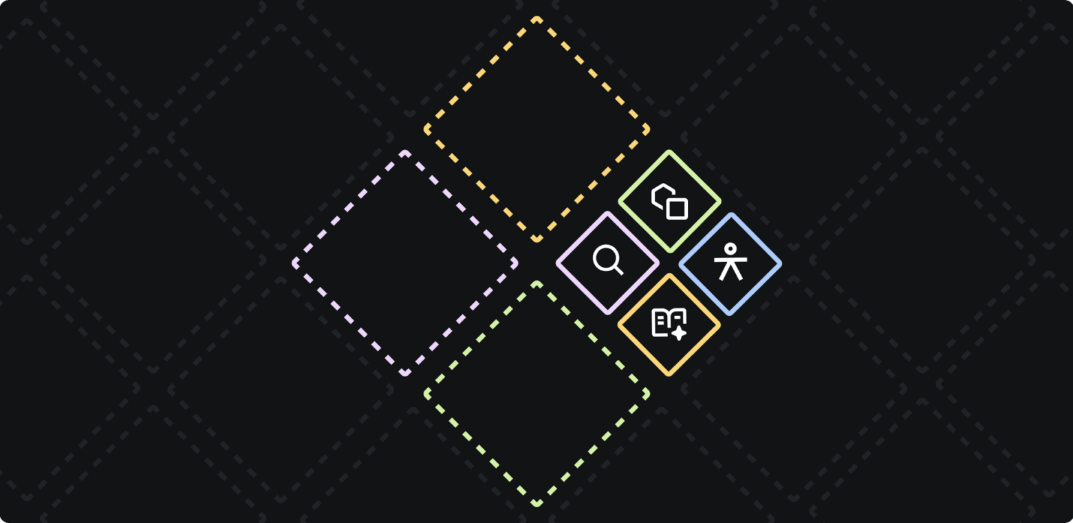
Building Accessibility into Our Design System DNA
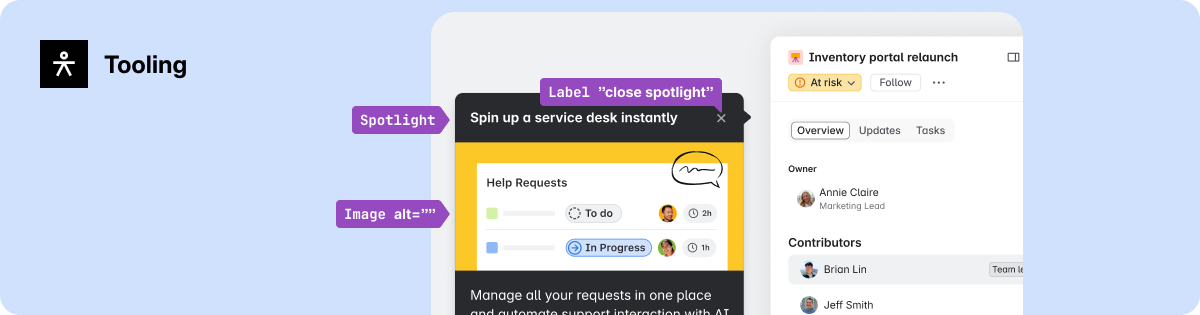
Two years ago, a dedicated Accessibility team was formed within the Atlassian Design System. Their mission was to structurally embed inclusion into design and engineering operations, focusing on integrating accessibility into the foundations, workflows, and tooling that define product delivery.
This initiative was guided by three core principles:
- Accessibility by Default: Components and foundational elements must meet accessibility standards from their inception.
- Tooling and Automation: Systems should automatically identify accessibility issues as they arise, minimizing remediation time.
- Maker Empowerment: Designers, engineers, and content designers are provided with the necessary guidance and checks to confidently build inclusive applications.
Embedding these principles across workflows has transformed accessibility from reactive fixes into a proactive measure of design quality.
Turning Principles into Practice
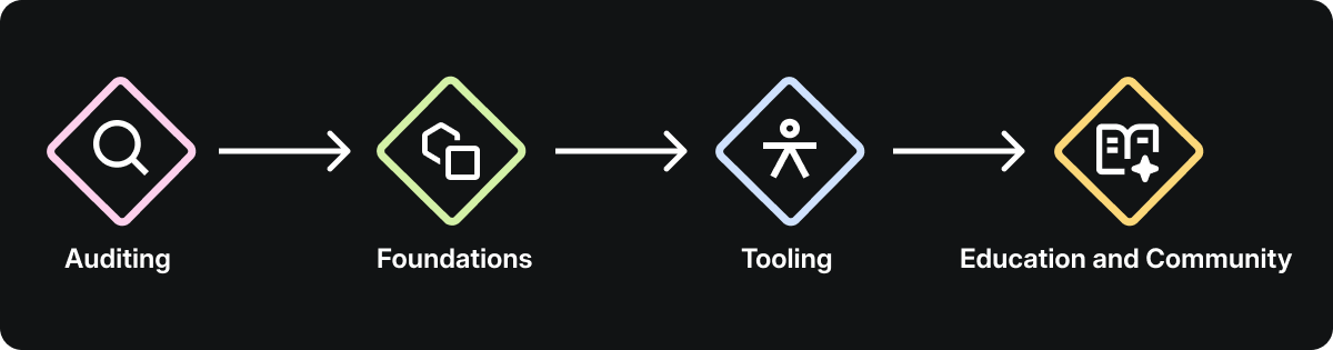
Scaling accessibility across a design system requires more than good intentions; it demands clear standards, thoughtful design trade-offs, and tools that facilitate inclusive decisions in daily practice. These elements, combined with our guiding principles, establish the strategic direction for our accessibility efforts and shape the team's focus areas.
Auditing and Uplifting Our Components
A system-wide audit was conducted to establish a baseline for accessibility across all components. Each component was evaluated for visual clarity, interaction design, and assistive technology support. The audit revealed challenges in areas such as contrast, focus management, and validation consistency.
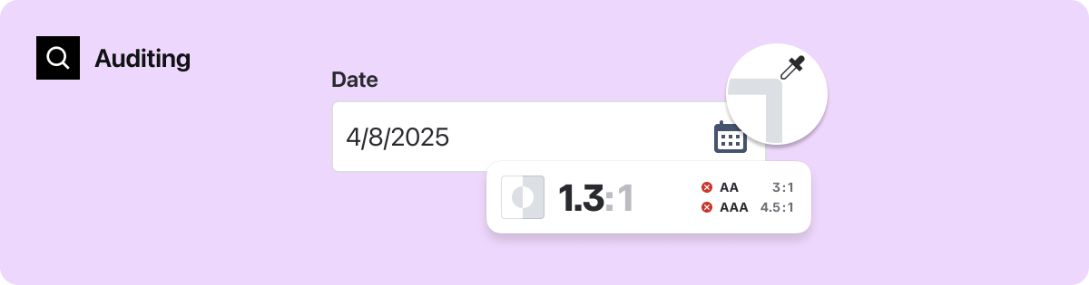
- Cross-Craft Evaluation: Assessing each component's structure, hierarchy, and semantics ensured consistency from design to implementation.
- Prioritization for Scale: Components most frequently used across Atlassian applications were prioritized, maximizing the system-wide impact of improvements.
- Design-Led Remediation: Audit findings highlighted design opportunities, such as increasing the contrast of input fields to enhance visibility and accessibility.
Strengthening Design Foundations
Accessibility's success is determined at the foundational level. If tokens for color, typography, or motion fail to meet standards, every product built upon them inherits those deficiencies. To prevent this, our foundations were recalibrated to create a more resilient and scalable system.
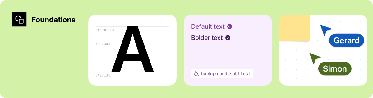
- Color: Tokens were updated to meet accessibility guidelines for color contrast in both light and dark themes, while preserving brand color hierarchy.
- Typography: Adjustments to size and weight improved legibility across various densities and user scaling preferences.
- Inheritance through Tokens: Improvements implemented at the system layer automatically propagate accessibility fixes to future components.
Building Tools for Makers
Accessibility scales effectively only when integrated into everyday workflows. Our Figma-based accessibility tooling exemplifies this, enabling designers to make inclusive decisions seamlessly within their design process.
- A11y Annotations: A custom Figma library empowers designers to consider accessibility early in the design process, not just during handoff.
- Contextual Guidance: Providing direct links to documentation within the design environment reduces friction.
- Cross-Craft Alignment: Shared annotations and specifications minimize ambiguity between design and engineering, fostering a consistent baseline.
Culture Through Education and Community
Accessibility has evolved from an individual responsibility to a shared organizational commitment across our design department.

- Accessibility Design Specialists: A community of advocates actively promotes elevated accessibility practices within their respective design teams.
- Leadership and Growth Integration: Accessibility is embedded into growth profiles, OKRs (Objectives and Key Results), and career development paths, making it a core aspect of design practice.
- Access to Experts: The Atlassian Design System A11y team offers regular office hours, demonstrations, and reviews, normalizing accessibility discussions across teams and crafts.
These focus areas developed in parallel as interconnected, cross-functional initiatives, collectively transforming accessibility principles into a scalable system practice.
Redefining Component Design: The Date-Time Picker
Our accessibility audit highlighted recurring issues in widely used components. The date-time picker was identified as a priority project, offering a prime opportunity to demonstrate how accessibility enhancements can improve usability and design quality at scale.
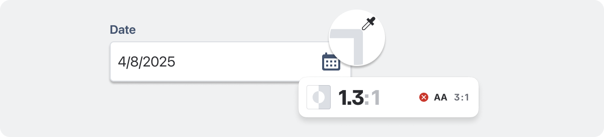 Example of an input field with insufficient border contrast, making it difficult for people with low vision to identify the interactive area.
Understanding the Opportunity
The audit uncovered significant visual and interaction barriers:
- Border colors failed contrast requirements.
- Focus management was inconsistent.
- Keyboard navigation for switching years required over 52 keystrokes.
- Assistive technology users experienced confusing behavior as the calendar automatically opened on focus, disrupting input flow.
The underlying issue was not a single defect but a pattern of design bias, where the component had been optimized for sighted users and mouse interactions. This bias created friction for individuals using keyboards and assistive technologies, as well as those who prefer direct date input.
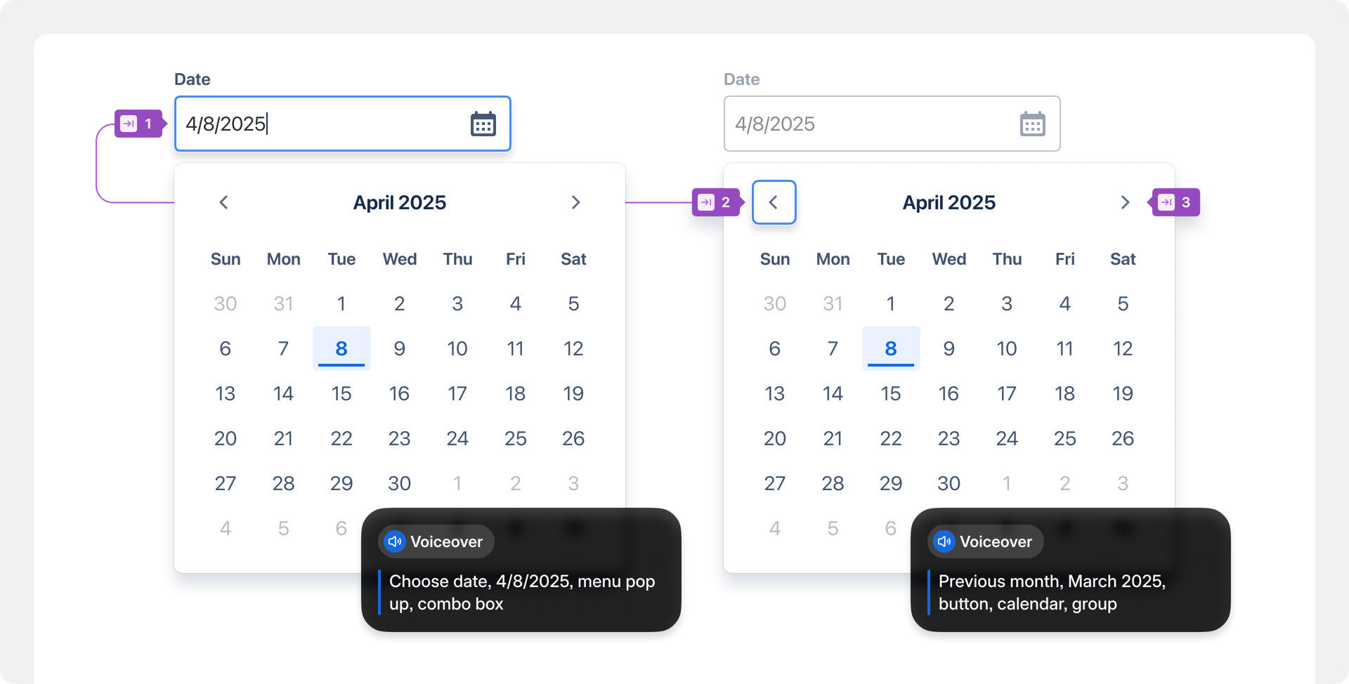 When a calendar opened automatically on focus, screen readers announced multiple elements simultaneously, leaving people unsure of their location or what was selected.
Designing for Inclusion
Reworking the date-time picker necessitated balancing accessibility, simplicity, and system consistency. The redesign focused on strengthening the component's semantic structure and interaction logic. Key design decisions included:
- Semantic Restructure: A new semantic layout with proper labels ensures predictable navigation for assistive technology users.
- Simplified Navigation: Keyboard input for date, month, or year selection was reduced from 52 to 12 keystrokes, significantly speeding up interactions.
- Clear Input Feedback: Consistent validation patterns and descriptive error messages were introduced to support all entry methods.
- Reduced Noise: Live region announcements were streamlined, prioritizing only essential updates.
- Improved Visual Clarity: Border colors and focus rings were adjusted to achieve at least 3:1 contrast across themes.
These updates transformed the component from a compliance risk into a model for accessible interaction, now faster to use, easier to perceive, and more predictable across various contexts.
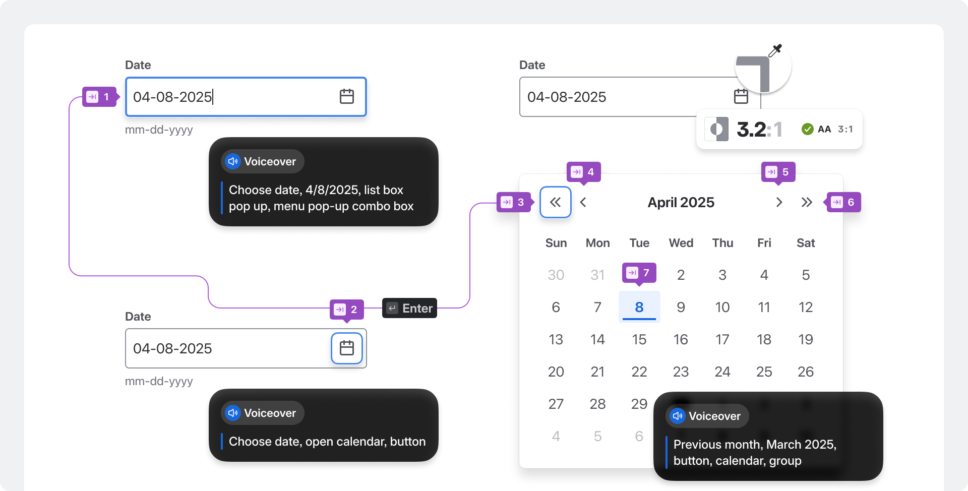 The improved date-time picker provides users full control over when to open the calendar, featuring clear navigation, descriptive labels, and predictable focus for those using keyboards or screen readers.
System-Level Impact
The comprehensive effort behind the date-time picker is just one illustration of our approach to every component: measured, collaborative, and built for scale. Each accessibility improvement strengthens the underlying design system, ensuring that enhancements in one component positively impact everything derived from it. Accessibility has become a clear indicator of design maturity across Atlassian applications, demonstrating that good design and inclusive design are inherently one and the same.
Raising the Accessibility Baseline
When accessibility is intrinsically built into the design system itself, improvements naturally scale. Teams can work faster, deploy with greater confidence, and deliver experiences that function seamlessly for everyone by default. Accessibility, as a foundational principle, shapes the behavior of every component and influences how teams measure quality. Design, content, and engineering all operate from shared standards for clarity, control, and inclusion.

These shared foundations have significantly raised the accessibility baseline across Atlassian applications, making inclusion a core part of our design and build process. This foundation-driven work has already yielded tangible results for customers, with over 6,000 accessibility issues resolved between June 2024 and June 2025. The momentum from this work sets the stage for future advancements: more adaptive foundations, more inclusive defaults, and a design system that continuously raises the bar for quality across Atlassian.
Remember: accessible design is not a separate goal—it is simply good design.