Building Interactive Code Playgrounds with React and SandPack
Create dynamic, interactive code editors in your React apps with SandPack. Learn setup, customization of templates, themes, and UI, plus advanced techniques using SandPack components and hooks for engaging live playgrounds.

Interactive code editors significantly enhance the user experience on websites and blogs, making them particularly valuable for programming tutorials, documentation, and showcasing code samples. Rather than relying on static snippets, integrating a code editor with a live output display or console offers a far more engaging and practical learning environment.
This article will guide you through creating an interactive code editor or playground using React and SandPack.
What is SandPack?
CodeSandbox is renowned as a leading cloud development environment, and SandPack is the robust bundler that powers its environments. This ensures SandPack is continuously updated and patched.
SandPack is a comprehensive component toolkit designed for embedding live code editors into your blogs and technical documentation. While a lightweight JavaScript bundler (sandpack-client) exists, this guide will focus on sandpack-react for building interactive UIs. You can find SandPack powering editors on many popular sites, including:
- The official React JS docs.
- Josh Comeau's blog.
- Varun Vachhar’s blog.
One of SandPack's standout features is its extensive customization options, coupled with its ease of use. Key features of sandpack-react include:
- Pre-built templates for popular languages and frameworks.
- A wide selection of pre-built themes for the editor, alongside the flexibility to create custom themes.
- Full support for all npm dependencies and major JavaScript frameworks.
- Numerous options to customize the UI and virtually every aspect of the playground.
- Ability to construct entirely custom playgrounds using pre-built composable components.
- Providers and custom hooks for creating highly tailored components.
Overview of the Playground
To begin using sandpack-react, install it via npm or yarn:
npm i @codesandbox/sandpack-react
# or
yarn add @codesandbox/sandpack-react
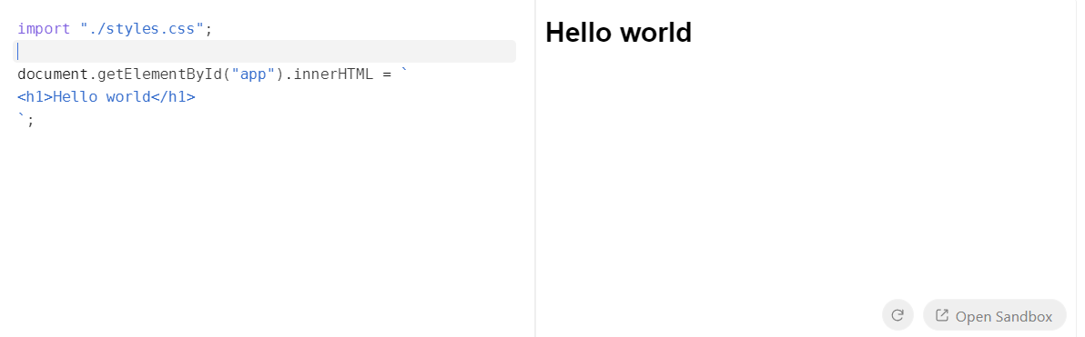
Next, import the Sandpack component and render it as follows:
import { Sandpack } from "@codesandbox/sandpack-react";

export default function App() {
  return <Sandpack />;
}
The <Sandpack /> component initializes a basic React template playground by default. Let's explore its fundamental props for customizing templates, themes, and more:
template: Accepts a predefined list of templates. The default isvanilla.files: This powerful property allows you to define multiple files with custom code, mimicking a regular folder structure. Thefilesobject maps relative file paths (keys) to their content (values). These files are then automatically displayed as tabs in the editor. Additional file-specific props likereadOnlyandactiveare also available.options: Provides extensive customization for various features. The full list includes useful options like:showLineNumbers: Toggles the visibility of line numbers.showTabs: Toggles the visibility of file tabs.classes: Assigns custom class names to existing template classes for advanced styling.
dependencies: An object containing any NPM packages required by your application, formatted similarly to apackage.jsonfile.theme: Choose from a selection of pre-built themes or implement a completely custom theme.darkandlightthemes are available by default, and pre-built themes can be imported from@codesandbox/sandpack-themes.
Customizing the Playground
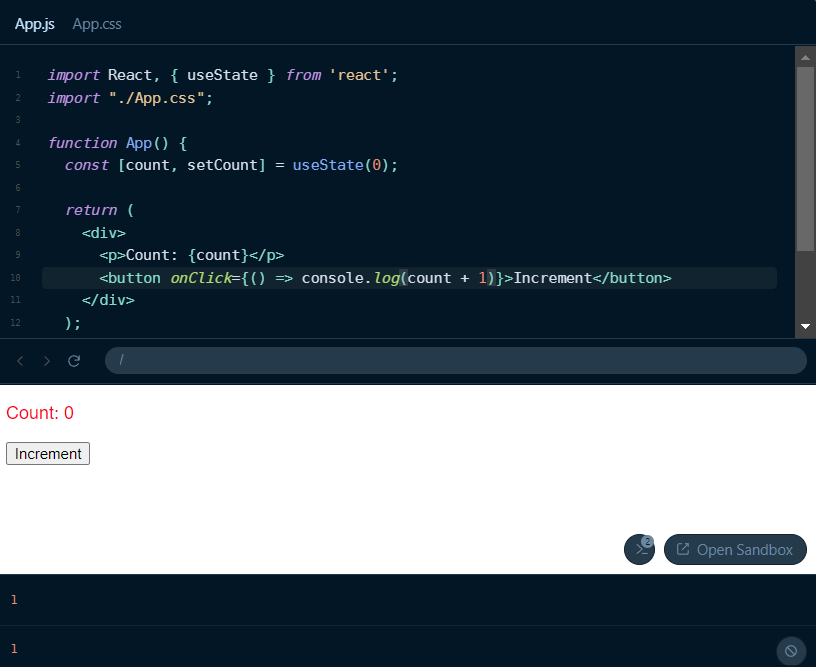
Let's tailor the default playground to fit a custom style and create an engaging example. Customizing the editor to match your site's theme ensures a seamless integration, making it feel less like a third-party embed. First, we'll use the files prop to set up a simple counter button, including both App.js and App.css.
Here’s an example with the corresponding code:
In this example, a counter component is rendered in the playground. The files object contains the code for both App.js and App.css. We've selected a theme from the pre-built options available via sandpack-themes to add visual styling, and line numbers are enabled.
You can also easily customize the layout of the playground by applying custom CSS classes or utilizing SandPack's built-in options. For instance, to apply custom classes:
<Sandpack
  theme={theme}
  template="react"
  options={{
    classes: {
      "sp-wrapper": "custom-wrapper",
      "sp-layout": "custom-layout",
      "sp-tab-button": "custom-tab",
    },
  }}
/>
This approach gives you fine-grained control over the visual design and layout through your custom CSS. SandPack also offers different layout modes: preview (default), tests (for running tests), and console (which renders a terminal/console component instead of a preview window, useful for server-side logic outputs). Additionally, you can switch the layout direction using the rtl (Right-to-left layout) option.
Customizing the Output
Beyond the editor itself, the output display is also highly customizable. You can control the visibility of the console, modify its layout, and even adjust the appearance of the preview window. While editor windows often receive extensive customization, the output display is equally important. The console displays errors and console.log messages. Depending on the code snippet, you might want to show or hide the console, or even toggle the visibility of the console button (hidden by default). As with all SandPack components, individual styling can be achieved using custom CSS classes.
<Sandpack
  template="react"
  files={files}
  theme={nightOwl}
  options={{
    showConsole: true,
    showConsoleButton: true,
  }}
/>;
The display window itself offers further customization. For example, you can enable or disable the navigator bar with the showNavigator option and control whether panels are resizable using resizablePanels.
<Sandpack
  template="react"
  files={files}
  theme={nightOwl}
  options={{
    showLineNumbers: true,
    showNavigator: true,
    resizablePanels: true,
  }}
/>
This customization could yield a result similar to this:
Advanced Usage
While pre-built options are excellent for quick setup, they can limit deep customization. For more advanced scenarios, SandPack allows you to fully customize the playground using its prefixed components and hooks.
Components
The sandpack-react package includes several SandPack-prefixed components that enable you to build custom setups and layouts for your code editor. Instead of relying on default presets, you can construct your own playground by combining components such as <SandpackCodeEditor>, <SandpackPreview>, and <SandpackConsole>. For instance, the default playground structure can be recreated like this:
import {
  SandpackProvider,
  SandpackLayout,
  SandpackCodeEditor,
  SandpackPreview,
} from "@codesandbox/sandpack-react";

export default () => (
  <SandpackProvider template="react">
    <SandpackLayout>
      <SandpackCodeEditor />
      <SandpackPreview />
    </SandpackLayout>
  </SandpackProvider>
);
This modular approach allows for virtually any layout imaginable, including multiple preview windows, custom HTML elements within the playground, and more. All the props and options discussed in previous sections remain valid here.
Hooks
To go beyond pre-built components and create your own, SandPack provides several hooks that grant access to the SandPack context. Some of the most valuable include:
useSandpack: This is the primary hook for accessing the entire context object. With the sandpack object, you can interact with the internal states of any component and use methods likecloseFileto manipulate those states. This hook must be used within aSandpackProvider, and all other hooks are built upon it.useSandpackNavigation: Useful for building custom navigation features, such as a refresh button. It provides therefreshfunction, which acts as an action dispatcher to trigger a sandbox preview refresh.useActiveCode: Provides the currentcodevalue and anupdateCodecallback. This is particularly useful if you wish to integrate your own syntax highlighter or external code editor.
These hooks offer complete control over the sandbox, enabling advanced features like fullscreen mode, auto-save, code formatting with tools like Prettier, and the use of custom icons and graphics.
Let's create a simple example demonstrating these hooks: a custom refresh button and a custom code editing component.
For the refresh button, we'll use the useSandpackNavigation hook, attaching its refresh function to a button's onClick event.
const RefreshButton = () => {
  const { refresh } = useSandpackNavigation();
  return (
    <button type="button" onClick={() => refresh()}>
      Refresh
    </button>
  );
};

// Usage within a SandpackProvider example:
// <SandpackProvider template="react">
//   <RefreshButton />
//   <SandpackCodeEditor />
//   {/* Hide the default refresh button */}
//   <SandpackPreview showRefreshButton={false} />
// </SandpackProvider>
Next, we'll use the useActiveCode hook to retrieve the code and integrate it into our own editor component. For this example, we'll use the React Monaco code editor. The code value is passed via the value prop, and the updateCode callback updates it on the onChange event. More details on useActiveCode can be found here.
const CustomEditor = () => {
  const { code, updateCode } = useActiveCode();
  return (
    <Editor
      height="100px"
      language="javascript"
      theme="vs-dark"
      value={code}
      onChange={updateCode}
    />
  );
};
The full demo would combine these, maintaining the layout discussed previously, but with the added custom refresh button and editor components. The core functionality of the playground remains consistent.
Conclusion
SandPack is a powerful, highly customizable tool for integrating live code editors into your applications. Its ease of use and extensive customization options make it an excellent choice for blogs, documentation, and any platform where interactive code editing can significantly enhance user engagement and provide a tailored developer experience.