Choosing the Right React Component Library: A Comprehensive Guide
Selecting the optimal React component library can significantly streamline UI development, but a wrong choice can lead to complex migrations. This guide offers an in-depth look at 15 battle-tested libraries, covering everything from comprehensive design systems to unstyled primitives, along with key evaluation criteria to match your stack and design needs. Learn how to enhance accessibility, performance, and developer experience in your production applications.
React component libraries streamline UI development, preventing the need to build fundamental elements like buttons, modals, and forms from scratch. However, selecting the wrong library can lead to costly migration challenges. Making an informed decision requires understanding when to use styled components versus headless primitives and how to align a library with your existing tech stack and design constraints.
This guide explores 15 highly-regarded libraries across diverse use cases, ranging from comprehensive design systems like Material UI to unstyled primitives such as Radix. It aims to help you select the ideal solution for your team's specific needs and project limitations.
What is a React component library?
A React component library is a collection of pre-built UI components, including buttons, forms, and navigation bars, designed for easy integration into your application. Instead of custom-coding each UI element, you can import and reuse tested, styled components, ensuring consistency and accelerating development.
Consider it a comprehensive toolbox for crafting interfaces. It provides consistent, reusable building blocks that work cohesively, resulting in a unified application appearance and enhanced team productivity.
Why React component libraries matter for production apps
Developing every UI element from scratch is time-consuming—up to 47% longer than leveraging design systems—and often leads to inconsistencies. When multiple developers create disparate versions of the same component, the user experience suffers. Component libraries address this by providing a standardized set of building blocks for the entire team.
Beyond aesthetics, production applications demand accessibility for users with disabilities (considering that 96% of top websites have accessibility errors), optimized performance for rapid loading, and maintainable code that remains stable across updates. High-quality libraries inherently handle these critical aspects, freeing developers from needing to be experts in every facet of UI development.
What to look for when choosing a React UI library
Not all libraries offer the same level of quality. Some may impress in demonstrations but prove inadequate for real-world applications. It's crucial to evaluate them based on criteria vital to your project's success.
Key evaluation criteria:
- Design System Fit: How easily can the library adapt to your brand's aesthetics? Look for robust theming capabilities, ideally utilizing design tokens for colors, spacing, and fonts.
- Developer Experience: Prioritize clear documentation with practical examples and strong TypeScript support for improved autocomplete and error detection.
- Performance Impact: Consider bundle size, as it directly affects load times. Verify if the library supports tree-shaking to eliminate unused code.
- Accessibility Built-in: WCAG compliance, keyboard navigation, and screen reader support should be standard features.
- Active Maintenance: Regular updates, prompt issue resolution, and a clear roadmap are indicators of a healthy and sustainable project.
Best React component libraries for design systems
These libraries offer complete design systems, providing consistent visual languages and extensive component coverage. They are excellent choices when you need a professional interface without building everything from the ground up.
Material UI (MUI)
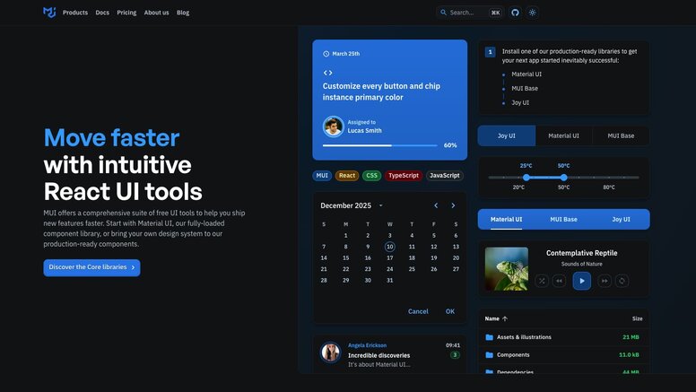
Material UI implements Google's Material Design principles within React, embedding Google's design philosophy into every component, from basic buttons to complex data tables. Its comprehensive coverage of UI patterns makes it one of the most widely adopted React libraries.
MUI boasts a vast ecosystem, including MUI X for advanced components like data grids and date pickers, catering to complex applications. Its documentation is thorough, and community support is robust.
The main considerations are bundle size and its distinct design opinions. Material Design has a specific aesthetic that may not suit every brand. However, for a comprehensive, production-ready solution, MUI is a strong contender.
Ant Design
Ant Design is engineered for enterprise applications, focusing on rich, data-heavy interfaces suitable for dashboards, admin panels, and business tools rather than consumer-facing websites.
It excels in handling complex forms, data visualization, and information-dense layouts. The design language is clean and professional, complemented by strong TypeScript support throughout. Built-in form validation and data handling minimize the need for external libraries.
The primary drawback is its unique aesthetic; Ant Design has a recognizable look, and significant effort is required to customize it to align with a different brand identity.
Chakra UI
Chakra UI emphasizes developer experience and accessibility. Its intuitive APIs allow for easy component styling using props like bg="blue.500" and p={4} for padding.
Its modular architecture enables importing only necessary components, contributing to smaller bundle sizes. Built-in dark mode support and responsive design props simplify common styling tasks, while accessibility features function out-of-the-box without extra configuration.
Chakra achieves a good balance between flexibility and convenience, making it a modern, well-documented, and rapidly growing choice.
Best React libraries for Tailwind CSS projects
Tailwind CSS has transformed styling methodologies with its utility-first approach. These libraries integrate seamlessly with Tailwind, providing component logic while maintaining the familiar utility class workflow.
Shadcn UI
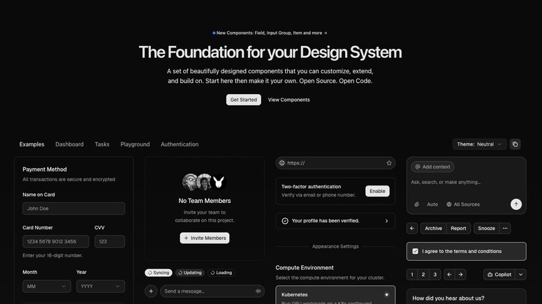
Shadcn/ui differs from traditional libraries as it's not installed via a package manager. Instead, you copy and paste component code directly into your project, granting complete ownership and control over every line of code.
Built upon Radix UI and Base UI primitives, with Tailwind CSS for styling, it offers aesthetically pleasing, accessible components that are fully modifiable without fighting library constraints. This copy-paste approach eliminates dependency management and version conflicts.
For teams prioritizing control and deep customization, this methodology is highly advantageous.
Headless UI
Developed by the Tailwind team, Headless UI delivers component behavior without any inherent styling. It handles complex logic for elements like dropdowns, modals, and tabs, allowing you to style them entirely with Tailwind classes.
It serves as a natural complement to Tailwind CSS, where you manage the visual design while Headless UI handles accessibility, keyboard navigation, and state management. Its components are rigorously tested and adhere to web standards.
DaisyUI
DaisyUI extends Tailwind CSS by introducing semantic component classes. Rather than writing bg-blue-500 text-white px-4 py-2 rounded, you can use concise classes like btn btn-primary. This significantly reduces markup verbosity while upholding Tailwind's utility-first philosophy.
It includes multiple themes and supports CSS variables for straightforward customization. Developers still have full access to all Tailwind utilities when needed, but common patterns become considerably cleaner.
Best unstyled React component libraries
Unstyled libraries provide functionality without imposing visual opinions. They handle state management, accessibility, and complex interactions, leaving all styling decisions to the developer. These are ideal for teams with well-established custom design systems.
React Aria
Adobe's React Aria Components manage the most challenging aspects of building accessible interfaces. It ensures proper keyboard navigation, screen reader announcements, and internationalization support for intricate components like date pickers and combo boxes.
The library intelligently manages focus, ARIA attributes, and interaction states, obviating the need for developers to be accessibility experts. This allows you to concentrate on styling while React Aria guarantees universal component usability.
Radix UI
Radix UI offers low-level primitives for constructing design systems. It provides foundational building blocks such as Dialog, Dropdown, and Tooltip, which can be composed into more complex components.
Many popular libraries, including shadcn/ui, are built upon Radix primitives. Directly utilizing Radix grants maximum flexibility and control over your component architecture.
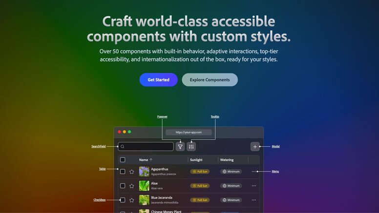
Base UI
Base UI, developed by the creators of Radix, Material UI, and Floating UI, provides unstyled React components with a strong focus on accessibility, performance, and developer experience.
It features a comprehensive set of components, including Accordion, Dialog, Menu, and Toast. Each component adheres to WAI-ARIA design patterns and is thoroughly tested across various browsers and screen readers. Base UI is compatible with any styling solution, including Tailwind, CSS Modules, or plain CSS.
Best React UI libraries for rapid prototyping
For projects where speed is paramount over extensive customization, these libraries offer expansive component collections and utilities, facilitating the rapid development of functional prototypes and MVPs.
Mantine
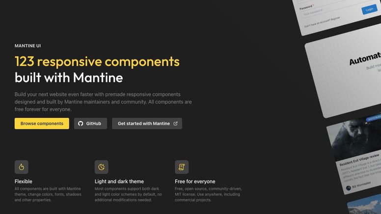
Mantine delivers over 100 components, alongside hooks, form management, and notification features, all within a single package. This integrated approach reduces dependency management and setup time, enabling quicker development.
Its contemporary design aesthetic is suitable for most applications without requiring extensive customization. Robust TypeScript support and comprehensive documentation ensure a smooth and predictable development workflow.
HeroUI (previously NextUI)
HeroUI blends elegant design with developer-friendly APIs. Built on React Aria for enhanced accessibility, it incorporates smooth animations and includes built-in dark mode support.
It offers seamless integration with Next.js, and its component APIs are intuitive. HeroUI is an excellent choice for projects requiring a polished appearance from the outset.
PrimeReact
PrimeReact boasts one of the largest available component collections, encompassing data tables, charts, and specialized business components. This enables the creation of complex, data-intensive applications without the need to source additional libraries.
Its extensive feature set is complemented by premium themes and templates accessible through its marketplace, making it a comprehensive solution for enterprise-level applications.
React-Admin
React-Admin is a framework specifically designed for building admin interfaces that interact with REST or GraphQL APIs. It comes equipped with built-in CRUD operations, authentication, authorization, and data management patterns.
Its flexible data provider architecture allows connection to any backend, while the component library expertly handles common admin interface patterns, significantly reducing the development time for functional admin panels.
Specialized React component libraries
Certain libraries address niche problems or cater to specific requirements, offering compatibility with existing systems or excelling in unique design philosophies.
React Bootstrap
React Bootstrap replaces Bootstrap's jQuery dependency with pure React components. This allows developers to leverage familiar Bootstrap classes and grid systems in React applications without JavaScript conflicts.
It's particularly useful for migrating existing Bootstrap projects to React or for teams already proficient with Bootstrap's design patterns.
Semantic UI React
Semantic UI React utilizes human-friendly HTML, providing component APIs that resemble natural language. This results in intuitive and self-documenting code.
How to choose a React component library that fits your codebase
Switching component libraries mid-project can be a painful and time-consuming process, often wasting weeks due to inadequate upfront evaluation. The optimal choice depends on your technology stack, design constraints, and the extent of customization required.
| Factor | Why it matters | What to look for |
|---|---|---|
| Bundle Size | Affects initial load time | Tree-shaking support, modular imports |
| TypeScript Support | Type safety and IDE help | Full type coverage, generic props |
| Theming System | Brand customization | CSS variables, design tokens, runtime theming |
| Framework Compatibility | Works with your stack | SSR/RSC support, Next.js compatibility |
| Accessibility | Legal compliance, user experience | WCAG 2.1 AA compliance, keyboard navigation |
Always review a library's GitHub activity before committing. A library with numerous stars but no recent commits (e.g., in six months) poses a liability. Look for consistent releases, responsive maintainers, and an engaged community that actively answers questions.
Which React component library works best for design-to-code workflows?
Traditional design handoff often breaks down when developers meticulously rebuild pixel-perfect Figma mockups from scratch, leading to guesswork regarding spacing and interaction states. This frequently results in lost details, a backlog of redline revisions, and overall team frustration.
Certain libraries facilitate this transition more effectively through official Figma kits and robust design token support. Material UI, Chakra UI, and Ant Design, for instance, offer Figma component libraries that directly correspond to their React implementations. When designers utilize these kits, the conversion to code becomes more streamlined.
Conversely, headless libraries like Radix UI are often superior for teams with bespoke design systems. Since they impose no visual opinions, tools that generate code from designs can apply exact tokens and classes without conflicting with pre-built styles.
Streamlining Design-to-Code with Builder.io Fusion
Many AI coding tools generate generic HTML/CSS or React/Tailwind code that doesn't align with your actual application's structure. They often fail to understand that your production application leverages specific React components with distinct APIs and styling patterns. While they might provide a prototype, developers typically have to rebuild everything using your actual component library.
Builder.io Fusion directly integrates with your codebase, supporting any library discussed here, including MUI, Chakra, Radix, or even custom components. Instead of generic markup, Fusion outputs code that utilizes your project's specific imports and adheres to your existing patterns.
Fusion's capabilities include:
- Component Generation: Create new components that respect your design system's constraints, spacing tokens, and variant patterns.
- Storybook Stories: Automatically generate Storybook stories for your components, complete with proper props and documented states.
- Design System Maintenance: Ensure your Figma designs and code components remain synchronized as your design system evolves.
- Visual Editing: Empower designers and project managers to compose UIs directly using your actual React components, not placeholder elements.
- Clean Code Output: The generated code uses your project's imports and patterns, eliminating the need for extensive rewriting.
If your team is struggling with rebuilding Figma designs from scratch, explore how Fusion can integrate directly into your repository.
Frequently Asked Questions
Can I use multiple React component libraries in the same project?
While technically possible, it is generally not recommended. Using multiple libraries can lead to increased bundle size, conflicting styles, and an inconsistent user experience. If specific components from different libraries are essential, consider using unstyled libraries or copying individual components rather than installing entire libraries.
How do I migrate from one React component library to another?
Begin by auditing your current component usage to gauge the scope of necessary changes. Develop a migration plan that addresses one component type at a time, starting with the most frequently used components. Leverage TypeScript to detect breaking changes and maintain a style guide to ensure visual consistency throughout the transition.
Do React component libraries work with Next.js and server-side rendering?
Most modern React component libraries support Next.js and server-side rendering (SSR), but it's crucial to verify compatibility before making a selection. Look for libraries that explicitly mention SSR support and provide Next.js examples in their documentation. Some libraries may require additional configuration for proper SSR functionality.
Should I build my own component library or use an existing one?
Developing a custom component library demands significant time and expertise in accessibility, testing, and ongoing maintenance. Opt for an existing library unless your project has unique requirements that no current solution meets, a dedicated team for maintenance, and sufficient resources for long-term support. Most teams will find greater benefit in customizing an existing library.
Which React component library offers the most brand customization?
Headless libraries, such as Radix UI and Headless UI, provide the highest degree of customization because they are delivered without any inherent styles.