Crafting Linear's Unique Interpretation of Apple's Liquid Glass Design
Linear details its ambitious mobile app redesign, inspired by Apple's Liquid Glass but engineered independently to meet the unique demands of professional users. Discover how they built a custom, flexible design system, drawing parallels with Aqua vs. ProKit, to enhance navigation and user experience for complex organizational workflows, enabling future adaptability and detailed accessibility.
Linear embarked on a mobile app redesign earlier this year, recognizing the original version, while effective for individual contributors, no longer fully served the diverse needs of larger, more complex organizations. The app, initially optimized for singular issue-focused workflows, struggled to provide the comprehensive overview desired by executives and managers. This necessitated a new, customizable foundation that would enable flexible, adaptable, and expandable navigation tailored to various user roles.

In June, a fortuitous announcement at WWDC—Apple's Liquid Glass—presented a design language that was both modern and expressive, aligning perfectly with Linear's envisioned aesthetic shift. However, a closer examination revealed that adopting Apple’s new APIs wouldn't provide the granular control required for the customizable navigation central to Linear's redesign. Consequently, the team decided to recreate their own version of Liquid Glass, aiming to capture its appealing qualities while retaining the flexibility to design a navigation experience perfectly suited to how users interact with Linear.

This decision represented a significantly harder path, especially for a small iOS team of just two engineers. While full adoption of Apple’s APIs would have been simpler, building their own system offered crucial advantages: it would bring the new navigation to all users, including those on iOS 18, and mitigate the compromises and uncertainties inherent in relying on an external design system. The team observed that Liquid Glass remained a moving target throughout the iOS 26 beta, with Apple continuing to introduce changes, such as the recently added Tinted Glass option. This 'go-big-or-go-home' moment solidified their choice. Their objective was not merely to replicate Liquid Glass but to elevate its design to align with the Linear brand and better serve their users' workflows.
Aqua versus ProKit
Building a proprietary design system, while seemingly unconventional, echoed a historical parallel within Apple's own design philosophy. Nearly two decades prior, Apple differentiated between consumer and professional software with Aqua and ProKit, respectively.
Aqua defined the look of consumer Mac software for nearly a decade, sharing Liquid Glass's exuberant qualities with pinstripes, bright highlights, glassy buttons, and extensive drop shadows, all designed to create a tactile and approachable interface.
Less remembered is ProKit, Apple's concurrent design language for professional tools like Final Cut or Logic. ProKit eschewed Aqua's reflections and translucency in favor of flatter gradients and sharper edges, prioritizing clarity and control crucial for complex, information-dense professional workflows over visual extravagance.

Liquid Glass serves as a beautiful successor to Aqua, primarily designed for a broad consumer audience, emphasizing fluidity and friendliness across diverse applications. Linear, however, operates under different constraints. Its users engage with the platform for specific, focused work, affording Linear the freedom to tailor its design in ways Apple cannot. This presented an opportunity to adopt Liquid Glass's aesthetic qualities—translucency, depth, and physicality—but apply them through a ProKit philosophy: purpose-built, disciplined, and optimized for sustained focus.
Owning our Materials
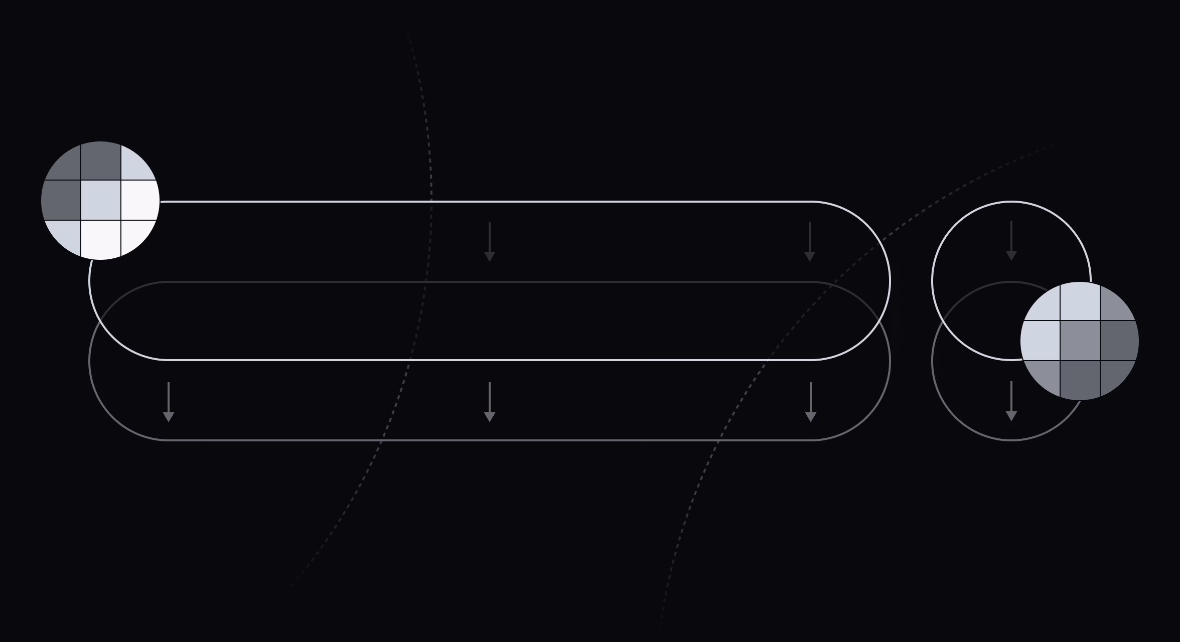
To recreate the glass effect from first principles, the team began with a single SwiftUI view modifier applying multiple effects simultaneously. A Gaussian blur, using a UIVisualEffectView, formed the base layer behind the content. On top of this, a subtle gradient provided structure, followed by a specular highlight calculated within a SwiftUI shader.
Achieving a convincing highlight required mathematically describing the shape. A signed distance field (SDF) was generated for the continuous rounded rectangle enclosing the content. Its gradient was then used to construct a normal map, which in turn determined light interaction at each point. Since the shader couldn't be directly applied to the UIVisualEffectView, it was layered on top using a Plus Lighter blend mode. Finally, the entire composition was masked with the same SDF, and a subtle shadow was added for contrast.
Beyond defining the surface, focus shifted to light behavior. Rather than static gradients, a physical light source was modeled, moving dynamically with user interaction. Real-time GPU calculations ensured natural surface responses, with soft highlights shifting fluidly during scrolling, tapping, or navigation.
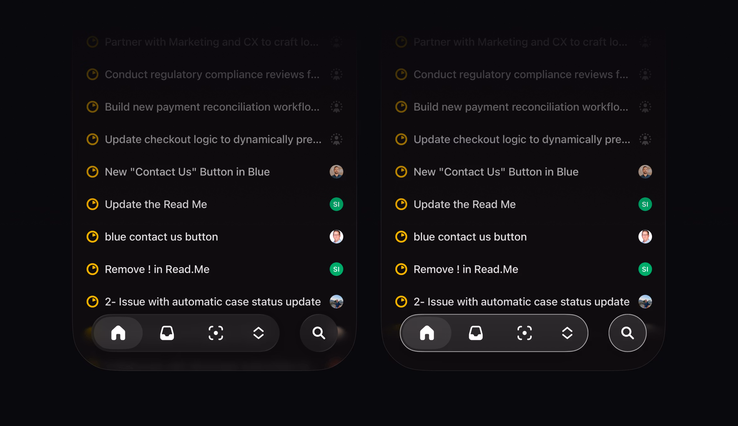
Implementing a Customizable Tab Bar
With control over the material, the team extended it to the most critical interface component for the redesign: the tab bar. While Apple’s stock iOS 26 tab bar appears similar superficially, it lacks meaningful customization in shape or behavior. To accommodate varied navigation patterns, Linear built its own expandable tab bar, a feat made possible by owning the underlying material.
This customization also provides future flexibility. While five items are typical for general audience apps, Linear users often require more. The custom tab bar can expand to accommodate additional entries, mirroring the iPad's ability to transform the tab bar into a sidebar.
Sweating the Details
Once the core system was established, attention turned to refining tactile and visual details for a modern interface. Touching an element now triggers a slight lift, providing immediate haptic feedback. Dragging beyond a view's edge introduces subtle distortion, resolving physical tension and enhancing UI responsiveness.
The team also replicated smaller Liquid Glass effects to ensure their custom material felt native to iOS. A variable blur is applied at the top and bottom edges of scroll views, intensifying as content nears the screen's boundary. This internal Apple detail, not exposed through public APIs, required creative implementation. A subtle color mask was layered over it to match Apple's system-wide soft edge.
Extensive effort was dedicated to accessibility. Apple’s system glass automatically adapts to settings like Increase Contrast mode, drawing solid outlines around glass elements when enabled. Linear’s custom material now precisely mirrors this behavior, preserving legibility for users with accessibility settings active.

The only effect deliberately omitted was Liquid Glass’s refraction. Technically, it demands pixel-level data unavailable to third-party developers. Aesthetically, refraction could also hinder readability in dense professional interfaces. By relying on precise blurs, masking, and dynamic lighting, Linear achieved depth without sacrificing clarity. While none of these individual details were overtly complex, their cumulative effect creates an enjoyable and productive user experience, embodying Linear’s commitment to quality.
Customization for a Growing User Base
This new visual language marks the beginning of a broader architectural redesign for Linear's mobile app. As the user base expands and diverse roles interact with the app in varied ways, this proprietary foundation lays the groundwork for more adaptable navigation and customizable toolbars in the future.