Dynamic Skewed Image Gallery with CSS `corner-shape` and Hover Effects
Learn to build a dynamic skewed image gallery using modern CSS, `corner-shape`, and interactive hover effects. This direction-aware design offers an engaging visual experience with minimal code.
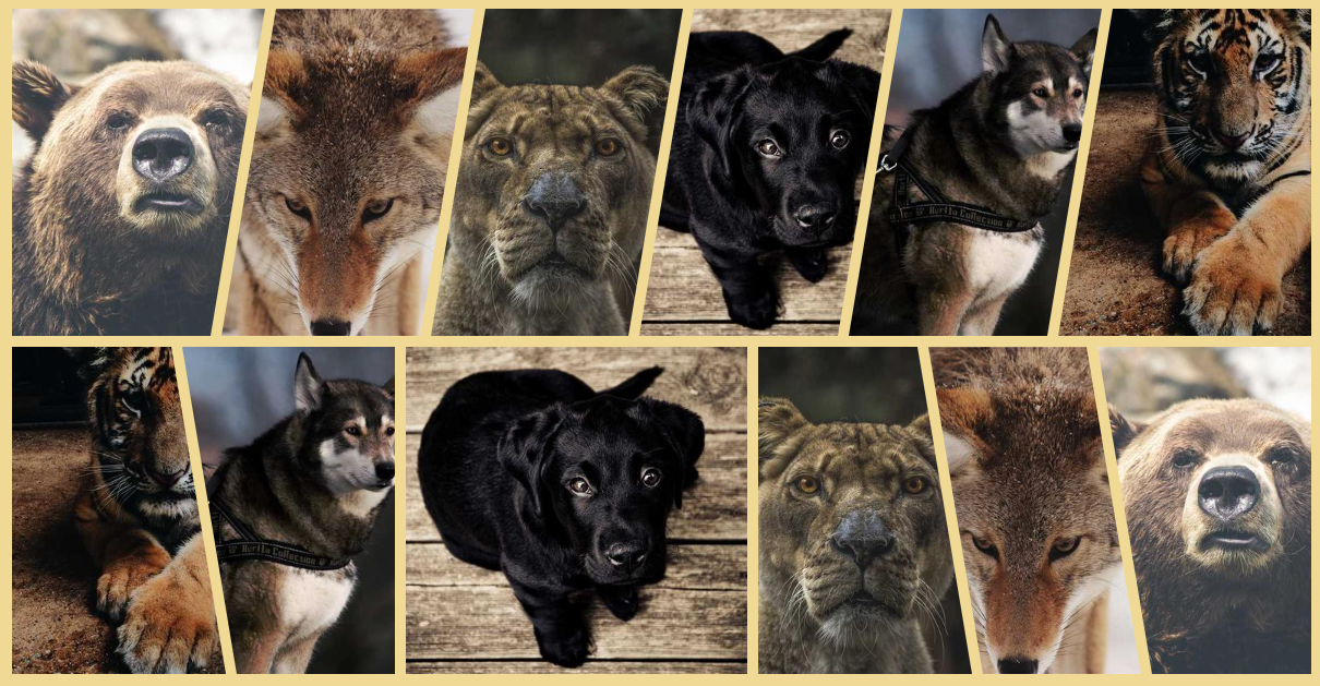
Published on December 02, 2025, this CSS tip explores how to create a visually striking gallery of skewed images with an interactive hover effect. Leveraging modern CSS, particularly the innovative corner-shape property, this component is achieved with just a few lines of code.
The skewing dynamically adjusts based on the text direction, showcasing another powerful direction-aware shape technique.
Here's the CSS implementation:
.gallery {
  --s: 50px; /* control the skewing */
  display: flex;
  gap: 10px;
}
.gallery > img {
  flex: 1;
  border-start-start-radius: var(--s) 100%;
  border-end-end-radius: var(--s) 100%;
  margin-inline-end: calc(-1 * var(--s));
  corner-shape: bevel;
  transition: .3s linear;
}
.gallery > img:hover {
  flex: 1.6;
}
.gallery > img:is(:first-child,:hover),
.gallery > img:hover + * {
  border-start-start-radius: 0 100%;
}
.gallery > img:is(:last-child,:hover),
.gallery > img:has(+ :hover) {
  border-end-end-radius: 0 100%;
  margin-inline-end: 0;
}
See a live demonstration on CodePen:
Gallery of skewed images (with hover effect) by Temani Afif (@t_afif) on CodePen.
Alternatively, an implementation using clip-path offers broader browser support, though it lacks the dynamic direction-aware functionality. You can explore this version here:
Gallery of skewed images (with hover effect) II by Temani Afif (@t_afif) on CodePen.
For more advanced CSS techniques, consider exploring other tips like "Fizz Buzz using Modern CSS (no HTML)", "Direction-Aware Arrow Shape using corner-shape", and "Dynamic Tooltip Position with Anchor Positioning IV".