Leveraging CSS `scroll-state(scrolled)` for Directional Scrolling Effects
Discover how the new CSS `scroll-state(scrolled)` query in Chrome 144 enables dynamic styling based on scroll direction, unlocking advanced UI patterns like hideable headers and directional animations with pure CSS.
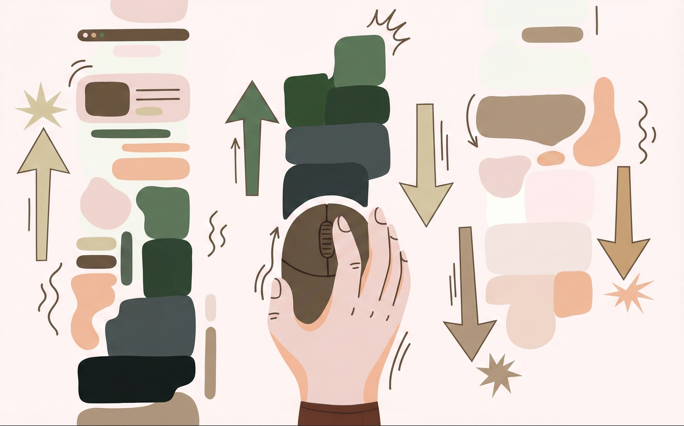
The new scroll-state() query introduces a scrolled state, now rolling out in Chrome 144. This powerful addition allows developers to apply styles dynamically based on the user's last scroll direction, opening up a wealth of possibilities for enhanced user interfaces.
How scroll-state() Queries Work
The scrolled value is the latest addition to scroll-state() queries, a set of container queries designed to respond to user interactions with page scrollers. First introduced in Chrome 133, other scroll-state queries include:
stuck: For style changes when an element is sticky to an edge (e.g., "is-sticky").snapped: For elements snapped on an axis, such as the active item in a carousel.scrollable: For applying styles when an element has overflow.
To utilize any scroll-state query, you must first set container-type: scroll-state on the parent element:
.parent {
  container-type: scroll-state;
}
Once configured, scroll-state() can be used like any other @container query:
.child {
  /* default styles */
  @container scroll-state(<type>: <value>) {
    /* scroll-based styles */
  }
}
The scrolled Query
For the scrolled query to function, ensure the parent scroller has content to scroll. For instance, on the html element:
html {
  container-type: scroll-state;
  overflow: auto;
}
With the container properly set up, you can query the scrolled state to detect the direction of the most recent relative scroll. It accepts several values: top, right, bottom, left, their logical counterparts (block-start, inline-start, block-end, inline-end), and multi-directional axis-based shorthands (x, y, block, inline). The none value indicates that the query container has not yet experienced a relative scroll.
The browser updates this state whenever the user scrolls, enabling descendants to be styled based on whether the user is moving down, up, left, or right.
/* Styles when the user has scrolled down */
@container scroll-state(scrolled: bottom) {
  .header {
    transform: translateY(-100%);
  }
}

/* Styles when the user has scrolled up */
@container scroll-state(scrolled: top) {
  .header {
    transform: translateY(0);
  }
}
Use Case: Hideable Header Bar (Fixed Positioning)
A common UI pattern is to hide a header or navigation bar when scrolling down and resurface it when scrolling back up. This provides increased screen real estate without requiring users to scroll all the way back to the top to access navigation.
This can be achieved with minimal CSS using scroll-state(scrolled). An example implementation demonstrates a fixed position top navigation that hides when scrolling downwards:
html {
  container-type: scroll-state;
}

header {
  position: fixed;
  inset: 0 0 auto;
  transition: translate 0.2s;
  translate: 0 0;
  /* Hide when you scroll toward the bottom */
  @container scroll-state(scrolled: bottom) {
    translate: 0 -100%;
  }
}
By showing the navigation bar by default and hiding it upon scroll, this API can be used as a progressive enhancement. In browsers that do not support scroll-state(), the navigation bar will remain visible with its fixed position.
Use Case: Hideable Header Bar (Sticky Positioning)
An alternative approach for a hideable navigation bar uses sticky positioning. This allows the navbar to initially take up space and remain at the top without scrolling with the page, and then animate out of view when scrolling down, reappearing when scrolling up. This maintains the existing user experience for unsupported browsers, as the navbar retains its default behavior.
html {
  container-type: scroll-state;
}

header {
  /* Convert to position:sticky and add transition when a scroll occurs */
  @container (not scroll-state(scrolled: none)) {
    position: sticky;
    top: 0;
    transition: translate 0.2s;
  }
  /* Hide when you scroll down */
  @container scroll-state(scrolled: bottom) {
    translate: 0 -100%;
  }
  /* Appear when you scroll back up */
  @container scroll-state(scrolled: top) {
    translate: 0 0;
  }
}
This method perfectly illustrates progressive enhancement, allowing for advanced UI features to be built atop existing designs without causing breakage in less capable environments. Unrecognized @container blocks are simply ignored by unsupported browsers.
Use Case: Directional Scroll Entry Animation
Another principle of animation suggests elements should animate from the direction they are activated. Combining scroll-state(scrolled) with scroll-triggered animations can enable dynamic transform directions based on scroll direction.
Consider two keyframes for sliding elements:
@keyframes slide-up {
  from {
    opacity: 0;
    transform: translateY(50px);
  }
  to {
    opacity: 1;
    transform: translateY(0);
  }
}

@keyframes slide-down {
  from {
    opacity: 0;
    transform: translateY(-50px);
  }
  to {
    opacity: 1;
    transform: translateY(0);
  }
}
By default, an element might use slide-up, but this can be dynamically changed to slide-down when scrolling upwards:
html {
  container-type: scroll-state;
}

.card {
  animation: slide-up 0.6s ease-out forwards;
}

.indicator::after {
  content: "Scrolling Down ↓";
}

@container scroll-state(scrolled: top) {
  .card {
    animation-name: slide-down;
  }
  .indicator::after {
    content: "Scrolling Up ↑";
  }
}
It's important to note that the scroll-triggered animations demonstrated here are based on an early preview API. Currently, changing animation direction can cause a re-play of the full animation on every item, rather than just those entering the viewport. Ongoing efforts aim to refine this behavior, ensuring animations only play when truly triggered within their range, not merely upon a general scroll direction change.