Liquid Glass Is Cracked, and Usability Suffers in iOS 26
iOS 26's 'Liquid Glass' visual language prioritizes aesthetic effects over usability, often obscuring content and replacing established conventions with problematic design patterns.
With iOS 26, Apple appears to be pushing further into visual design and decorative UI effects, but at a significant cost to usability. While the system may initially present a fluid and modern aesthetic, practical use quickly reveals that its shimmering surfaces and animated controls often impede interaction. This article will examine how these design changes impact real-world user experience.
In This Article:
- Liquid Glass: Apple’s New Visual Language
- Crowded, Smaller Tap Targets
- Predictability, Lost
- Changing Conventions
- Discoverability in Decline
- The Bigger Picture
Liquid Glass: Apple’s New Visual Language
iOS 26 introduces Apple’s new glassmorphic visual language to its devices. Apple describes "Liquid Glass" as:
“a translucent material that reflects and refracts its surroundings, while dynamically transforming to help bring greater focus to content, delivering a new level of vitality across controls, navigation, app icons, widgets, and more.”
In simpler terms, the interface now ripples and shimmers as if the phone were encased in gelatin. While visually appealing at first, practical problems emerge almost immediately upon use.
Transparency = Hard to See
"Liquid Glass" renders UI elements translucent and bubbly, resulting in a light, airy, but often nearly invisible interface. A fundamental principle of usability dictates that anything placed on top of another element becomes harder to discern. Yet, in 2025, Apple is seemingly disregarding this by obscuring text, icons, and controls through transparency layered over busy backgrounds.
Text placed over images is widely known to hinder readability due to insufficient contrast. So, the question arises: why does Apple now encourage users to set photos as backgrounds for text messages?
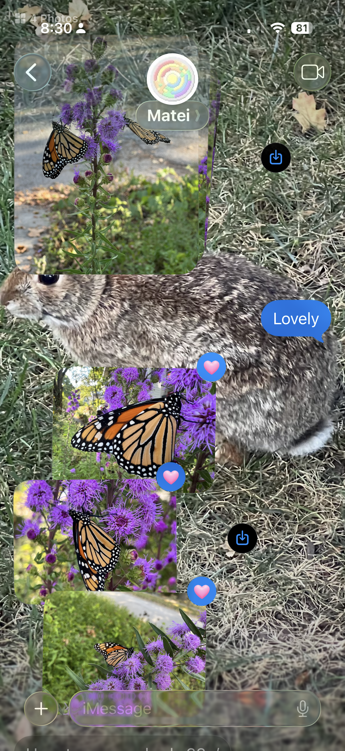 Apple Messages: iOS 26 encourages users to choose a background image for text messages. Doing so makes it substantially harder to read the text or easily notice other content, such as photos. It also obscures the input field (not to mention the in-field placeholder "iMessage").
The consequence is that your friend’s words are camouflaged against their beach vacation photo or, worse, their pet’s fur. Content might be technically “in focus,” but it becomes unreadable and invisible.
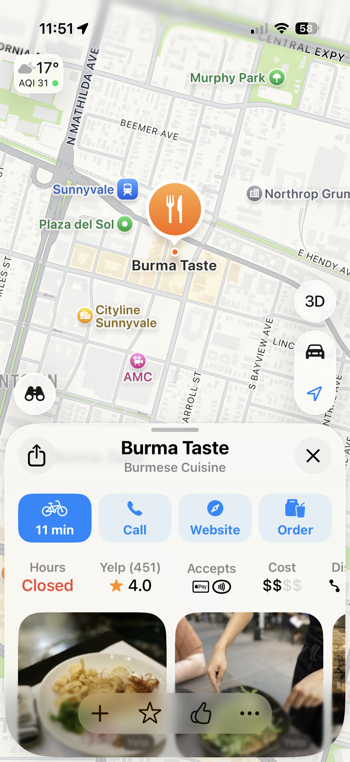 Apple Maps: Icons at the bottom of the screen blend in with the background images, despite the background being blurred.
Apple’s most audacious (or perhaps ill-advised) experiment is the implementation of text on top of text. It seems designers assume users possess exceptional vision and infinite patience, as deciphering one line of text superimposed on another is now a common occurrence. Reading an email subject line now demands cryptographic decoding skills worthy of a Dan Brown novel. The result is not only illegible but also aesthetically unpleasing.
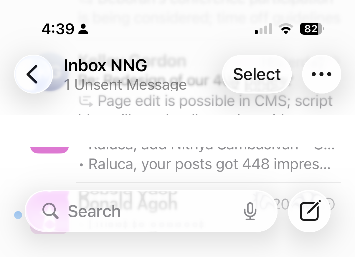 Mail: Text on top of text creates an illegible mess.
Semitransparent floating controls are prevalent in iOS 26. Titles, search bars, tab bars, and even the phone’s status bar now float above the page content. These elements not only obscure the underlying information but also sometimes compete for attention with other on-page elements.
 Safari: The browser’s floating controls (URL bar, back button, ellipsis menu) now compete for attention with in-page floating buttons. Additionally, the phone's status bar interferes with in-page content.
Animated Buttons: Motion Without Meaning
Animations can be delightful initially. When used intentionally, they can create a satisfying sense of completion, a feeling of something "clicking" or "snapping" into place. Our eyes are acutely sensitive to motion, making animated buttons instant attention-grabbers. However, this delight quickly devolves into distraction after the tenth, twentieth, or hundredth repetition.
In iOS 26, controls insist on animating themselves, regardless of whether it benefits the user. Carousel dots subtly morph into the word "Search" after a few seconds. Camera buttons exhibit a slight jerk when tapped. Tab bars bubble and wiggle during view transitions, and buttons briefly pulsate before being replaced by something entirely different.
The interface seems to be shouting “look at me” when it should quietly recede, allowing the true star – the content – to take the spotlight.
 Homescreen: The carousel dots change into a search bar.
 Tabs shimmer, bubble, and wiggle when switched.
 Buttons pulsate when selected.
Even controls that haven't been touched cannot resist displaying motion. In the Phone app, switching from "All Calls" to "Missed Calls" mysteriously turns the filter button blue, as if missed calls merit filtering but all calls do not.
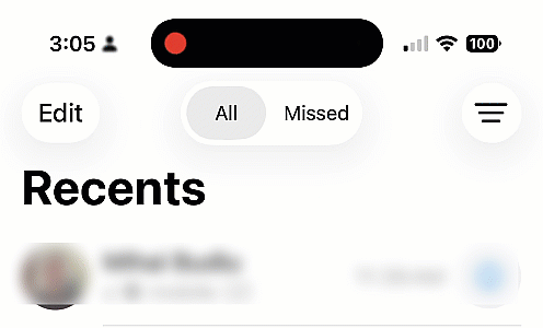 Phone: Switching from "All" to "Missed Calls" turns the filter button blue, likely to indicate that a filter was applied and only some calls – the missed ones – are visible. The intention is good, but the change of color is unnecessary and distracting, given the selected state of the segmented control "Missed" at the top. Or perhaps the designers were afraid that the selected state was too subtle?
Meanwhile, in the Music app, the current song title scrolls like a stock-market ticker, shimmering with watery highlights as you navigate up and down. Reaching the top of the page causes the title bubble to abruptly leap upwards to accommodate the tab bar.
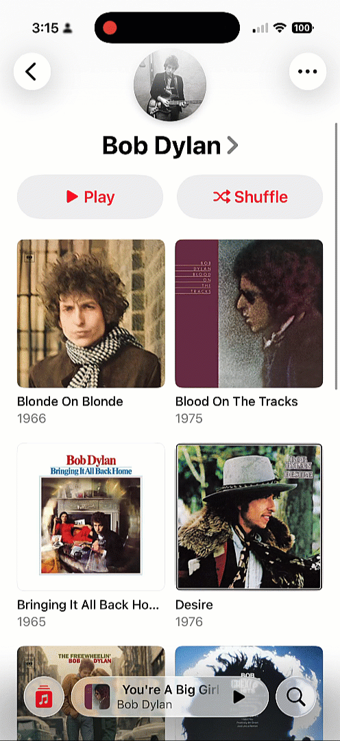 Apple Music: The song title ticks and shimmers, and jumps up to make room for the tab bar when the user scrolls up to the top of the page.
Motion for motion’s sake is not usability; it is distraction accompanied by a side of visual discomfort.
Crowded, Smaller Tap Targets
Apple has also opted to crowd and shrink touch targets. The long-established guideline of at least 0.4cm between targets (and 1cm × 1cm tap areas) appears to have been disregarded. It seems Apple either believes our fingers are shrinking or assumes years of smartphone practice have magically endowed users with perfect precision for tiny targets.
 Photos: In iOS 18 (left), controls are much farther apart than in iOS 26 (right).
In iOS 26, tab bars exemplify this approach: they feel cramped and squeezed, seemingly to make room for the ever-present search button that lingers in the bottom-right corner of nearly every page.
 App Store in iOS 18 vs iOS 26: In iOS 26 (right), the tab bar at the bottom of app pages has been split between navigation and search – with search occupying a larger space and navigation categories being crammed together.
Because this search button floats separately from the rest of the bar, navigation feels fragmented. One control is isolated while others are bunched together, disrupting the sense of a unified control area and making the entire bar harder to scan at a glance. This heavy emphasis on search feels borrowed from Google’s playbook, which is ironic given Apple’s reputation for developing its own distinct design language.
Predictability, Lost
We have long understood that constantly changing interfaces are detrimental to user experience. In the past, Microsoft Office experimented with adaptive menus that reordered themselves based on recent use. Users disliked them intensely because nothing remained in its learned position, necessitating a rescan of the menu every single time. The interface became unlearnable due to its constant flux.
Apple seems to have overlooked this crucial lesson. In iOS 26, controls appear, vanish, collapse, and expand depending on context. For example, the tab bar collapses whenever search is activated, making room for the search field.
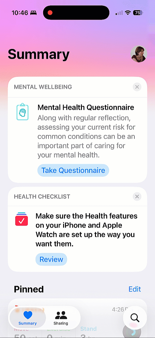 Health: The tab bar collapses whenever the search box is expanded.
Safari introduces its own inconsistency: the forward button appears and disappears based on whether there is a page to navigate forward to. While this might seem logical in theory, in practice it disrupts consistency. Changing the size and location of a target makes the interface harder to learn and less predictable.
 Safari: The browser toolbar sometimes contains only a back button (left), and sometimes it also includes a forward button (right).
Instead of fostering reliable habits, users are now forced to play hide-and-seek with navigation controls.
Changing Conventions
In earlier iOS versions, search was located at the top of the page. In apps like Mail or Messages, users had to scroll down to reveal the search bar. While not the most immediately discoverable pattern, years of repetition ingrained it as second nature.
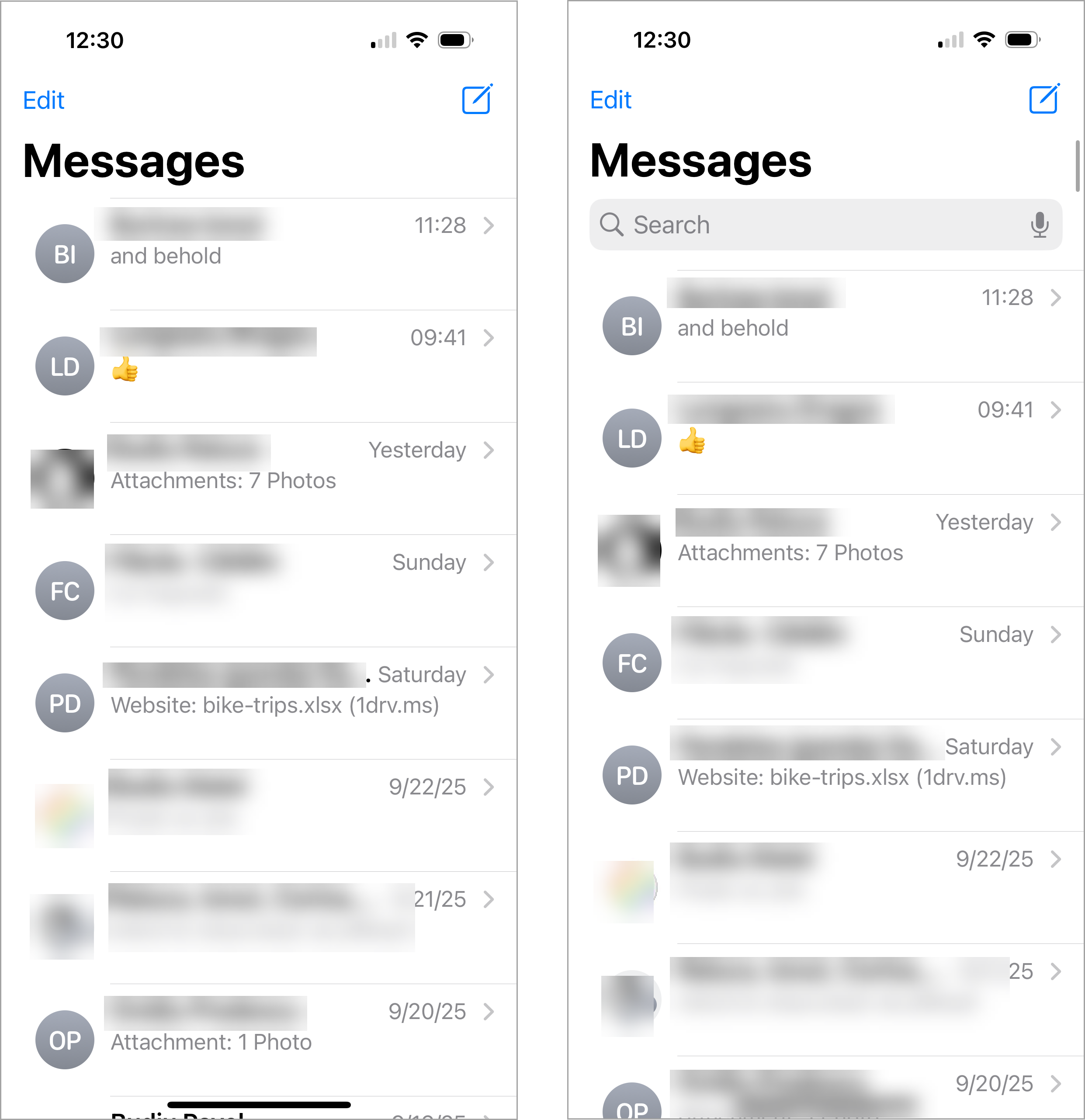 Messages (iOS 18): Search was hidden by default (left). To access it, users had to “pull down” the top of the page (right).
Now, in iOS 26, search has migrated to the bottom of the screen and is always visible. For new users, this might seem easier to find, but for long-time users, it represents a jarring break from established habits, slowing them down until the new pattern becomes ingrained. Even if the new pattern proves beneficial over time, existing users must relearn it, which in the short term translates to lost productivity and increased frustration.
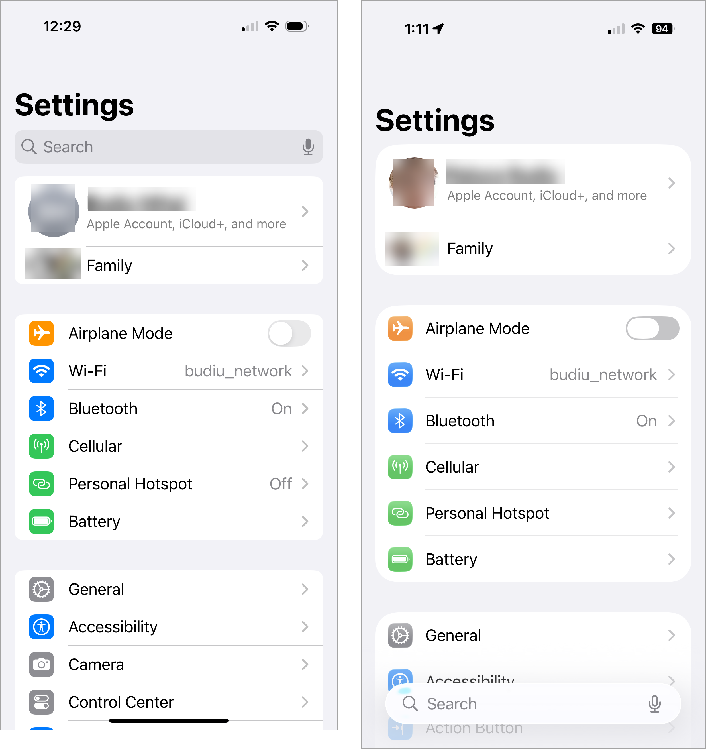 Settings app: Search is at the top in iOS 18 (left) and at the bottom in iOS 26 (right).
To further complicate matters, search is styled as a floating bar that sometimes interferes with page content. Its pale design also tends to blend into the background, making it easy to overlook. Our past research on floating buttons indicated they are most effective when they clearly stand out, not when they blend in and risk being missed.
Discoverability in Decline
The back button, once a helpful guide accompanied by a breadcrumb, has lost its informational trail. Instead of indicating the previous page, it now lacks a label, forcing users to guess its destination.
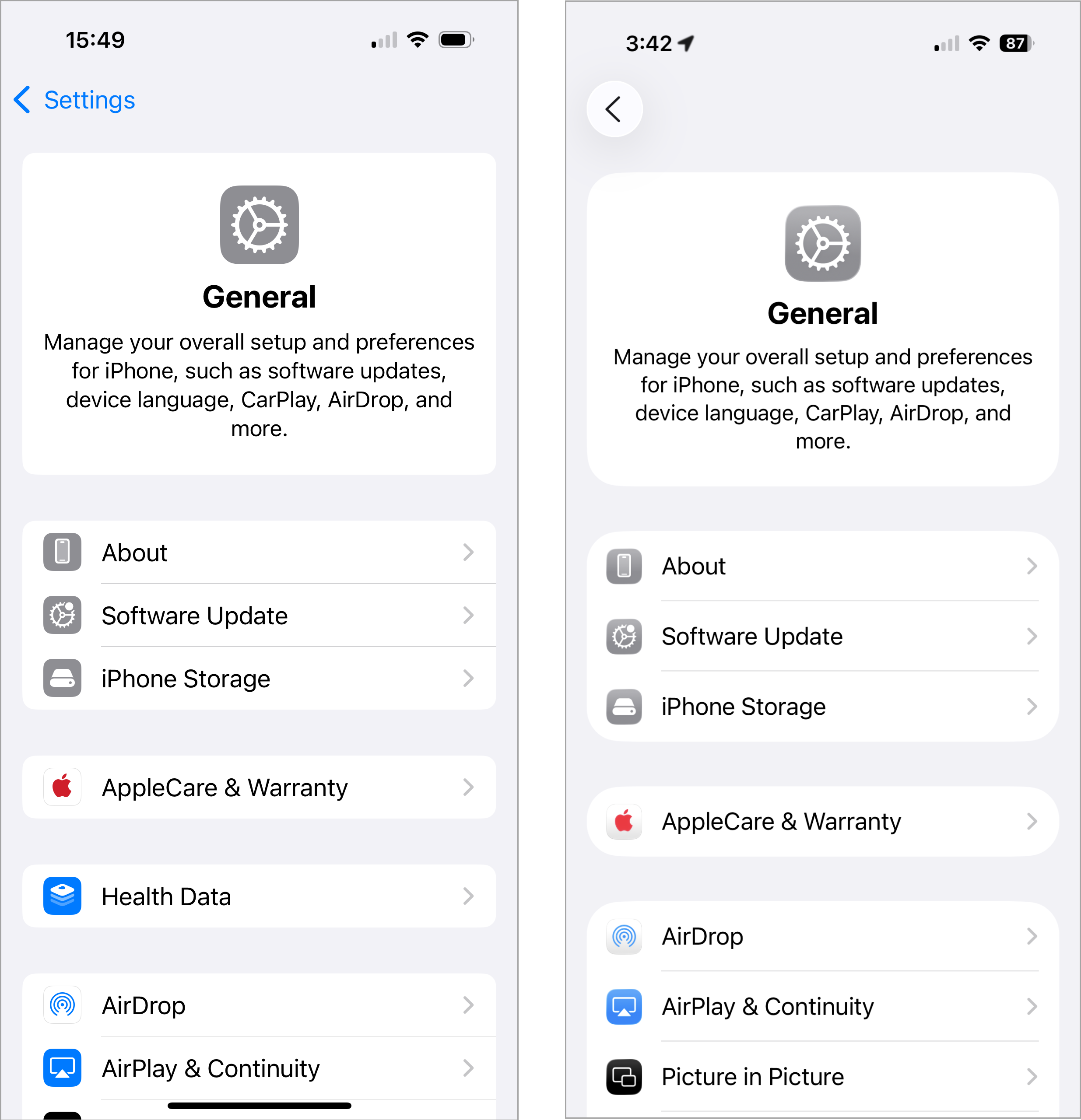 Settings: The back button used to have a breadcrumb next to it, indicating the page the user came from (left). In iOS 26 (right), that label has been removed.
This change signals another shift (this time for the worse) towards an Android-style design, where page titles are left-aligned (instead of center-aligned), thereby displacing the breadcrumb next to the back button. This design choice could cause significant confusion for users, as some apps may retain a breadcrumb while others replace it with the current-page title.
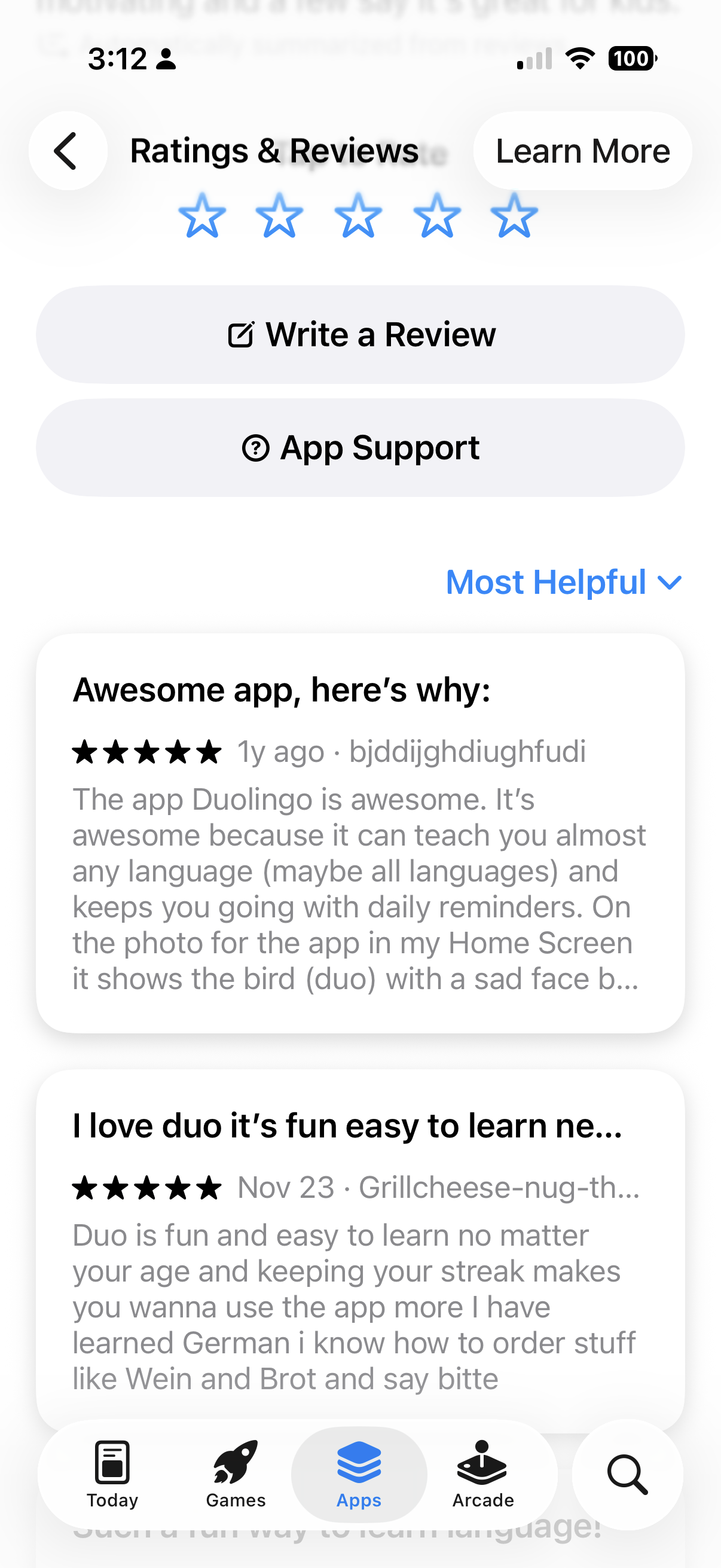 App Store: The current page’s title “Ratings and Reviews” takes the place of the iOS 16 back-button breadcrumb.
Safari adds its own frustrations: the URL bar is squeezed between icons, truncated to the point where it’s difficult to discern the current website. And tabs, once accessible with a single tap, are now hidden within an overflow ellipsis menu, requiring extra steps. Not only does this design violate best practices for overflow menus (which dictate that only nonessential actions should be hidden), but every additional tap wastes precious seconds, multiplied by the millions of times users switch tabs daily.
 Safari: The URL bar is squeezed between other toolbar buttons, making it hard to know what site you’re on.
 In iOS 18, tabs used to be visible in the browser toolbar (left); in iOS 26 they are hidden under an ellipsis menu (right). On the bright side, there is a label “All Tabs” next to the corresponding icon.
The Bigger Picture
iOS 26 introduces “Liquid Glass” controls overlaid on noisy backgrounds, jittery animated buttons, shrunken and crowded tab bars, collapsing navigation, and ubiquitous search bars. Furthermore, it deviates from long-established iOS conventions, moving closer to Android’s design philosophy.
Overall, Apple is prioritizing spectacle over usability, lending credibility to the theory that “Liquid Glass” is an attempt to distract customers from iOS 26’s promised, yet currently absent, AI features.
The interface is restless, demanding, less predictable, less legible, and constantly pulls focus rather than supporting seamless access to content. Instead of streamlining everyday tasks, iOS 26 forces users to relearn basics while enduring a constant parade of visual theatrics.
Apple may call it “Liquid Glass.” To many users, however, it feels more like a fogged-up window: pretty from a distance, but frustrating when you try to see beyond it.