StyleX: Meta's Styling System for Large-Scale Web Applications
Discover StyleX, Meta's open-source styling system, combining CSS-in-JS ergonomics with static CSS performance for scalable, type-safe, and predictable styling.
Published: November 11, 2025
Categories: Open Source, Web
By: Melissa Liu
StyleX is Meta’s robust styling system engineered for large-scale applications. It uniquely combines the developer ergonomics of CSS-in-JS with the performance advantages of static CSS. This system generates collision-free atomic CSS while providing an expressive and type-safe environment for style authoring.
StyleX was open-sourced at the close of 2023 and has since been adopted as the standard styling system across numerous Meta products, including Facebook, Instagram, WhatsApp, Messenger, and Threads. Beyond Meta, prominent companies like Figma and Snowflake also leverage StyleX.
At its core, StyleX operates as a compiler that extracts styles during the build phase to generate a static stylesheet. However, it's more than just a tool; it embodies a philosophy for authoring, sharing, and maintaining CSS at scale. StyleX simplifies styling for everyday engineers by introducing constraints that promote predictability, enable powerful composition, and scale effortlessly across diverse teams and codebases.
How Do We Build CSS at Scale?
To fully grasp StyleX's purpose, let's review the evolution of CSS at Meta. Serving CSS at such immense scale historically led to collisions across bundles, difficulties in managing dependencies between stylesheets, and challenges in reconciling competing rules. These issues frequently escalated into "specificity wars," forcing engineers to rely on complex selectors and !important tags, resulting in brittle and hard-to-maintain styles. Furthermore, large, monolithic CSS bundles meant browsers were downloading hundreds of kilobytes of unused rules on every page load, significantly slowing rendering and interaction.
To counter these problems, Facebook developed cx, a CSS-modules-like system that linked local CSS directly to JavaScript. cx successfully resolved issues with namespace collisions and dependency management but was limited to static styles defined in separate files.
// ComponentName.css; class uses ComponentName/namespace syntax

.ComponentName/header { margin-top: 10px }
// ComponentName.js

<div className={cx('ComponentName/header')} />
When we undertook the ambitious task of rebuilding Facebook.com from the ground up, we seized the opportunity to create a superior styling solution. This period coincided with the growing momentum of the CSS-in-JS movement. Developers increasingly sought to colocate styles with component code, write dynamic styles based on runtime state, and harness JavaScript paradigms such as import graphs, module scoping, and type systems. However, early CSS-in-JS systems often relied on runtime injection—dynamically generating <style> tags and mutating the DOM during render—patterns that introduced measurable performance overhead.
import * as stylex from '@stylexjs/stylex';


const styles = stylex.create({
  foo: { margin: 10 }
});


function MyComponent({}) {
  return <div {...styles.props(styles.foo)}/>
}
Building on the insights from this movement, we crafted a system that is CSS-in-JS in form, but whose styles compile directly to static CSS. StyleX quickly superseded our precursor cx system, fundamentally transforming our approach to styling. With StyleX, styles were now defined in JavaScript, enabling advanced composition, conditional logic, and crucial build-time compilation. The adoption of atomic classes led to an 80% reduction in CSS size and made styling maintainable across a rapidly expanding codebase.
Today, StyleX stands as the default styling system at Meta, powering everything from user-facing product surfaces to foundational component libraries. Engineers leverage it to build interfaces that are expressive, reusable, and highly performant.
Into the Compiler
The true power of StyleX lies in its abstraction. It automatically handles CSS specificity, variable generation, and static compilation to produce predictable, collision-free atomic CSS. This eliminates the heavy maintenance burden of hand-authored CSS styles, allowing developers to concentrate solely on style authoring.
StyleX resides within a monorepo comprising several integrated packages. Its core engine is a Babel plugin that performs a transform across a project and extracts the CSS. At a high level, the compiler traverses a set of files, extracts CSS metadata from style objects, and converts style declarations into atomic CSS classes. The collected metadata then undergoes several processes: value normalization, at-rules wrapping, and legacy polyfills. Finally, the CSS rules are sorted and outputted into a static stylesheet.
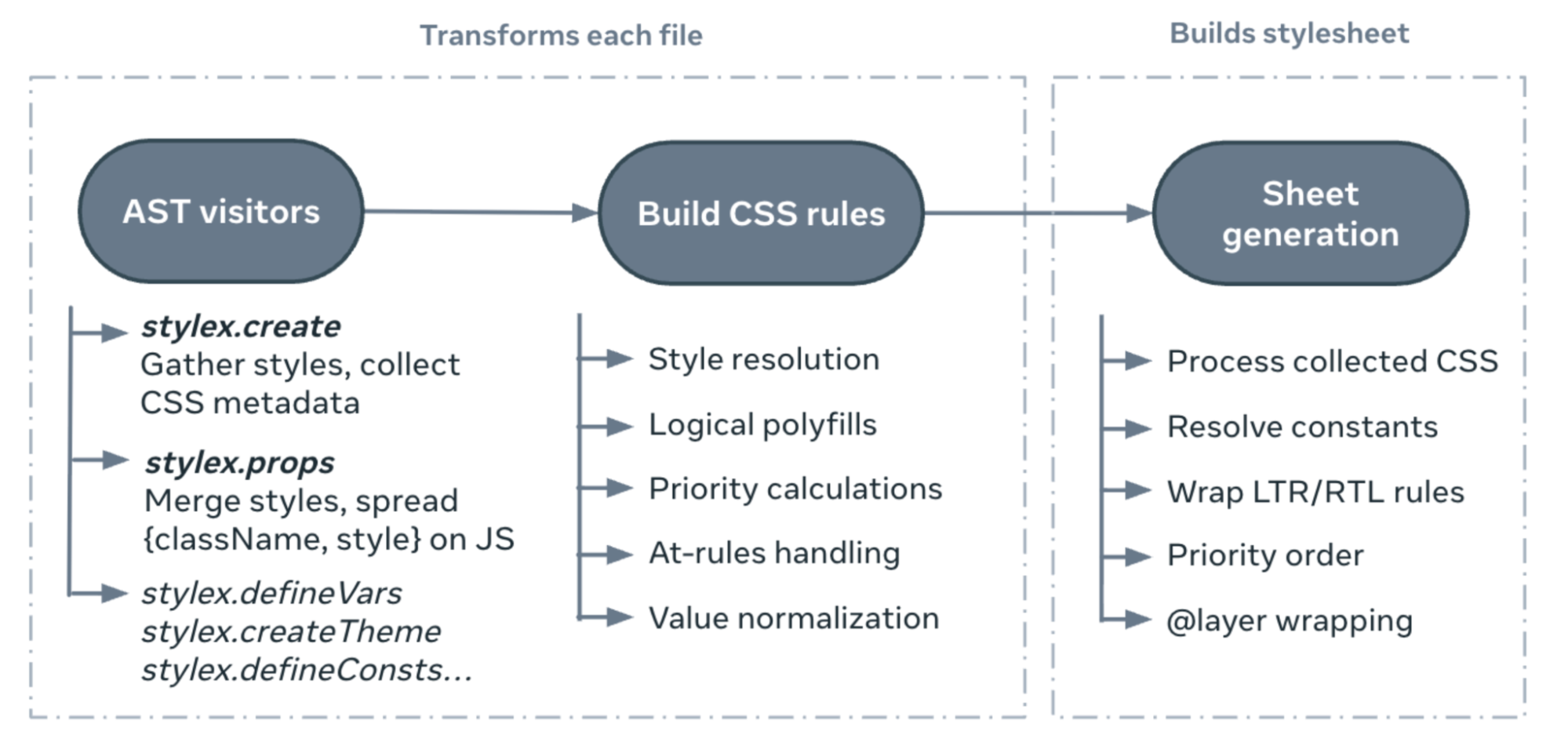
Let's delve deeper into the behind-the-scenes of this process by exploring the core values of StyleX.
Scalability
Central to StyleX's design is its static compilation into atomic CSS. Styles are converted into classes containing a single style declaration, designed for maximum reuse across a codebase. This approach ensures that CSS size plateaus even as the application grows. Whenever possible, styles are compiled away and cached per file, allowing the system to analyze all reachable styles, deduplicate shared declarations, and emit only what is strictly necessary at runtime.
The core API surface is intentionally lightweight: stylex.create() is used to define style objects. These objects are stripped away at build time and transformed into atomic CSS. Each property: value pair is hashed and outputted as a CSS class. This API is optimized for cacheability and exclusively permits statically resolvable values.
stylex.props() manages the merging and deduplication of style objects. Each call is transpiled into an object containing a space-separated className string corresponding to each atomic style, and a style prop for dynamic styles. For styles local to a module, compilation occurs at build time; for styles used across module boundaries, the system defers to a tiny runtime merge.
import * as stylex from '@stylexjs/stylex';


const styles = stylex.create({
  foo: { margin: 10 },
  bar: { margin: 10, color: 'red' }
});


function MyComponent({style}) {
  return (
    <>
     <div {...styles.props(styles.foo)}/>
     <div {...styles.props(styles.bar)}/>
     <div {...stylex.props(style)}/>
    </>
  );
}
In each JavaScript file, API calls are replaced with the class names from the generated CSS, and local styles are stripped away. The component above, for instance, compiles to something like this:
import * as stylex from '@stylexjs/stylex';


function MyComponent({style}) {
  return (
    <>
     <div className="m-10" />
     <div className="c-red m-10" />
     <div {...stylex.props(style)}/>
    </>
  );
}
After the transform is executed across all files, the collected metadata is processed. This includes generating LTR/RTL variants, resolving constants, and ordering CSS rules by priority. The final output is a string that can be emitted as a static stylesheet and further post-processed by any of our bundlers.
.m-10 { margin: 10px }
.c-red { color: red }
Expressiveness
StyleX frames constraints as fundamental design principles rather than limitations. We disallow conflict-prone patterns like "styling at a distance" and enforce patterns that are statically resolvable. Within these defined boundaries, however, StyleX maintains significant expressiveness. We’ve achieved maximum flexibility through the following APIs.
Shareable Values
stylex.create() is optimized for per-file cacheability: all CSS metadata must be derived exclusively from the JavaScript defined within that specific file. We utilize an extended version of Babel’s evaluate function to resolve values, meaning the compiler never needs to read the contents of imported modules to generate the stylesheet.
To enable reusable values across files, StyleX provides APIs like stylex.defineVars() and stylex.defineConsts(). These functions generate deterministic hashes based on variable name and import path, ensuring consistency across modules. This allows us to resolve variables wherever they are imported without traversing the file that declares them. At build time, shared constants are fully inlined, while shared variables become global CSS custom properties that can be referenced across components.
// varsFile.stylex.js
const varColors = stylex.defineVars({primary: "#eee"})

// constsFile.stylex.js
const constColors = stylex.defineConsts({primary: "#fff"})


// Component.react.js
import {varColors} from 'varsFile.stylex.js'
import {constColors} from 'constsFile.stylex.js'


const styles = stylex.create(
  {
    foo: {color: varColors.primary}, // → .x { var(--hash('varsFile.varColors.primary')) }
    bar: {color: constColors.primary} // → hash('constsFile.constColors.primary') → #fff
  },
);
Styling at a Distance
As previously mentioned, StyleX is fundamentally a system for styling components. Elements are styled by applying classnames directly. Global and complex selectors are explicitly disallowed to prevent "styling at a distance"—rules that indirectly affect elements from other parts of the DOM. Global baseline rules, such as element selectors or CSS resets, must be defined in a separate stylesheet. This approach minimizes indirect styling and promotes the encapsulation of styles.
/* Unsafe: styles leak to child elements rather than being explicitly applied */
.csuifyiu:hover > div
{ ... }

/* Safe: styles are scoped to a specific element based on observed state */
div:hover > .ksghfhjsfg
{ ... }
However, we do permit "observing from a distance" using the stylex.when APIs. This API offers a suite of relational selectors to style a component based on the state of its ancestors, descendants, or siblings. Observed elements must be marked with stylex.defaultMarker(), ensuring styles remain directly applied while supporting contextual behavior.
const styles = stylex.create({
    foo: {
      backgroundColor: {
        default: 'blue',
        [stylex.when.ancestor(':hover')]: 'red',
      },
    },
});


<div {...stylex.props(stylex.defaultMarker())}>
  <div {...stylex.props(styles.foo)}> Some Content </div>
</div>
Preserving CSS Features
StyleX diligently preserves most of the CSS feature set—including media queries, pseudoclasses, keyframes, and more—through static transforms during build time. Wherever possible, we mirror native CSS behavior to ensure styling feels expansive and familiar.
While StyleX is built around static compilation, it also gracefully supports dynamic styles. When a value is not known at build time, the compiler emits a CSS variable reference, and the runtime writes it inline via the style prop.
const styles = stylex.create({
    // Height is unknown until runtime
    foo: (height) => ({
      height,
    }),
});


// { .d-height {var(--height)}, style: {--height: height} }
<div {...stylex.props(styles.foo(height))}/>
Theming APIs like stylex.defineVars() and stylex.createTheme() empower users to create and modify shareable design tokens. defineVars() establishes a variable grouping, and createTheme() allows users to create variants by redefining variable groups at a higher specificity.
/* const spacing = stylex.defineVars({sm: 2px, md: 4px, lg: 8px}) */
:root, .sp-group{--sp-sm:2px;--sp-md:4px;--sp-lg:8px;}

/* const desktopSpacing = stylex.createTheme(spacing, {sm: 5px, md: 10px, lg: 20px}) */
.sp-dktp.sp-dktp, .sp-dktp.sp-dktp:root{--sp-sm:5px;--sp-md:10px;--sp-lg:20px;}
stylex.defineConsts() enables users to define shareable constants and media queries without overloading browser memory with CSS variables. During compilation, StyleX gathers metadata from all defineConsts() calls, generates placeholder hashes in create() calls, and directly inlines the constant values into the generated stylesheet.
Finally, APIs such as stylex.keyframes() and stylex.viewTransitionClass() provide robust support for animations by generating @keyframes and ::view-transition-* rules.
Predictability
StyleX is fundamentally a system for styling components. We discourage global styling in favor of directly applying localized classnames to elements. Our design prioritizes predictable style merging: the last style always wins! You can conceptualize the stylex.props function as a deterministic merge of style objects: given stylex.props(styles.foo, styles.bar), bar will consistently override foo. This facilitates easy sharing and combination of styles predictably across files.
CSS specificity operates on a hierarchy where selectors are assigned different priorities. This calculation is based on a three-column value of IDs, classes, and types, commonly represented as (ID, Class, Type). Because StyleX is entirely class-based, resolving conflicts between style objects involves determining which class names to apply and enforcing priorities among them.
const styles = stylex.create({
  foo: { color: 'red', margin: 0 },
  bar: { color: 'black', marginTop: 10 }
});


function MyComponent() {
  // becomes <div className="c-black m-0 mt-10" />
  return <div {...stylex.props(styles.foo, styles.bar)} />
}
During the merge process, repeated properties across style objects are deduplicated, ensuring that only the last value is applied. Consequently, each class name on the DOM node corresponds to a single property. In the example above, the color: red class is dropped during the merge, allowing color: black to take precedence. However, resolving overlaps between shorthands and their constituent longhands is inherently more complex.
Consider the following HTML:
<style>
  .margin-top-10 { margin-top: 10px }
  .margin-0 { margin: 0px }
<style/>


<div className="margin-0 margin-top-10" />
When multiple classes are applied to a div, the resulting styling depends solely on the specificity of the selectors (in this case, the order of the classes). Without additional handling, margin here completely overrides margin-top!
Introducing pseudoclasses and media queries further complicates matters:
{
   [ "m-0", { "css": ".m-10 {margin: 0}" }, 3000 ],
   [ "mt-10", { "css": ".mt-10 {margin-top: 10px}" }, 4000 ],
   [ "mt-10-mq", { "css": "@media (...) {.mt-10-mq {margin-top: 10px} }" }, 4200 ],
   [ "mt-10-mq", { "css": "@media (...) {.mt-10-mq:hover {margin-top: 10px} }" }, 4320 ]
}
To manage this ambiguity, we compute a numerical priority alongside each CSS rule. These priorities, combined with a user-configured styleResolution, determine the specificity of each class selector using the @layer at-rule or an equivalent polyfill.
The enforced ordering is illustrated as follows:
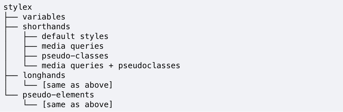
The result? Longhands and shorthands merge predictably, :active states reliably override :hover states, media queries take precedence over default behavior, and user-authored order is respected whenever possible. This sophisticated, behind-the-scenes specificity handling empowers developers to combine and reuse styles without the burden of manually resolving conflicts.
Looking Forward
StyleX is actively maintained by a dedicated team of CSS enthusiasts committed to making styling accessible to all. Beyond the core compiler, the monorepo encompasses an ESLint plugin for style validation, a CLI for simplified stylesheet generation, a PostCSS plugin for post-processing, and an experimental CSS parser.
The open-source community has been instrumental in shaping StyleX's direction and has acted as a massive force multiplier for our efforts. We continuously learn, grow, and innovate through collaboration with the companies and individuals adopting our work. Today, with the help of thousands of contributors, the ecosystem boasts a community-built playground, VS Code extensions, an SWC compiler, multiple bundler integrations, and more.
We are constantly exploring new avenues to establish StyleX as the definitive styling system for the modern web. Our work is an ongoing dialogue between the evolving needs of the community and the foundational values that guide our design. Key roadmap highlights include an API for shareable functions, LLM-ready context files, support for inline styles, enhanced developer extensions, strict compiler validation, logical styles utilities, and an official unplugin for seamless bundler integrations. Our ultimate goal is to continue evolving alongside browser capabilities and persistently reimagine what web styling can achieve.
Happy style authoring! We create StyleX for you.
Learn More
To stay updated on StyleX, visit the StyleX website, GitHub, Bluesky, and X.
To delve deeper into Meta Open Source, explore our website, subscribe to our YouTube channel, or follow us on Facebook, Threads, X, Bluesky, and LinkedIn.
Acknowledgements
Special thanks are extended to past maintainers Naman Goel and Sebastian McKenzie; contributors Frank Yan, Jerry Su, Ankit Sardesai, Joel Austin, Daniel Neiter, Nicolas Gallagher, Vincent Riemer, Ezzudin Alkotob, Andrey Sukhachev, Nitish Mehrotra, Nadiia D., Prakshal Jain, JC Pérez Chávez, Samantha Zhan, Chang Yan, Tina Gao, Anay Bhakat; advisors Christopher Chedeau, Baraa Hamodi, Dennis Wilkins, Chris Callahan, Richard Hansen, Robert Maratos, Will Hastings, Ricky Li, Andrew Imm, Tim Yung, Eli White; the Modern CSS leads; the Web Platform organization; the vibrant open-source community; and the legacy of systems like React Native and Linaria that continue to inspire our work.