The Counterproductive Contact Page: A Design Dilemma for Service Businesses
This article explores the concept of a 'go-away' contact page, a design choice often seen in large companies that deters user contact, and why it's a detrimental approach for service-based businesses, highlighting client management and design education challenges.
Many years ago, I worked with a client that provided a service. For the purpose of anonymity, we'll refer to them as a design agency. Their primary offering was a comprehensive design package, but a substantial portion of their income also came from smaller, related tasks such as one-off campaigns or newsletter designs. While customers could potentially handle these tasks themselves, the appeal of saving time by delegating them to an expert proved a tempting offer for many, contributing significantly to the client's revenue.
Our team was commissioned for a complete website redesign. Initially, the process flowed smoothly, with all wireframes receiving approval without complications. However, during the design phase, we encountered obstacles. The client frequently presented inspiration sites they admired, requesting deviations from the approved wireframes to integrate similar aesthetics. The core issue was their focus on aesthetics rather than user experience. Their design choices were driven by preferences like 'we like the balance of imagery and text on this page' rather than 'we believe this design will achieve the page's intended goal.' While an appreciation for visual polish is understandable, the client had inadvertently embraced a design trap: what I refer to as a 'go-away contact page.'
What is a 'Go-Away' Contact Page?
A 'go-away contact page' is a design strategy employed by companies that, in essence, aim to deter direct user contact. These pages are commonly found on the websites of large organizations, particularly Software-as-a-Service (SaaS) providers, who seek to minimize support expenditures by subtly concealing primary support channels behind login barriers. Such companies often implement tiered support systems: enterprise clients typically have dedicated customer success managers accessible via phone, while lower-tier customers might navigate various in-app ticketing systems. The underlying objective is to encourage self-service through knowledge bases, effectively reducing the volume of direct inquiries and guiding users to resolve issues independently.
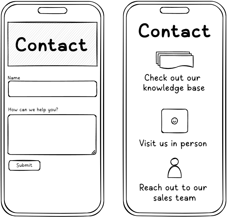
This approach was entirely unsuitable for our client, a service-based agency. While a large SaaS company aims to reduce incoming inquiries and filter out less determined contacts through unappealing options, a service company strives to demonstrate helpfulness and cultivate leads. These are fundamentally opposing objectives.
From a user perspective, encountering a 'talk to our sales team' button can often create a sense of apprehension. Such a page quickly becomes a perceived 'no-go zone,' prompting users to exit as swiftly as possible, anticipating they will need to resolve their query independently. For a business that thrives on convincing people to delegate tasks, introducing friction at such a critical point in their sales funnel is counterproductive.
How Were They Convinced to Reconsider?
Despite our efforts, we were unable to sway their decision. In retrospect, perhaps more could have been done, but the project's trajectory had consumed our focus on mitigating other client-requested changes that would have significantly escalated design or development time beyond the initial scope. Effectively, we were preoccupied with addressing more pressing issues. This redesigned contact page, although we recognized its problematic nature, was not deemed a critical 'fire,' and thus it proceeded.
The project concluded on schedule, payments were made, and the client expressed satisfaction with the outcome. Nevertheless, I harbored significant disappointment. While I firmly believe in the intrinsic value of quality design, I also acknowledge the prevalent 'smoke-and-mirrors' within the industry and disliked the notion that I might have inadvertently contributed to it. Even with client satisfaction, the result fell short of my personal standards for a quality product I would proudly endorse, leaving a sense of having let down both the client and their end-users.
How to Avoid Implementing a 'Go-Away' Contact Page
Our challenges likely originated even before the design tools were engaged. Offering discounted rates to this client, perhaps as a courtesy, inadvertently set an unfavorable precedent. Rather than perceiving us as bringing valuable knowledge and expertise, they tended to view us merely as executors of their predetermined vision.
For those unfamiliar with the design process, it's often tempting to regard phases like discovery and wireframing as mere hurdles before reaching the more engaging visual identity design. Regrettably, some designers also fall into this trap. As service providers, we must enhance our efforts in educating clients about the design process and the fundamental importance of each stage. While it may seem unconventional in some circles, understanding the 'why' behind a project is crucial for successful execution. This is why establishing architectural foundations precedes brand considerations. Flowcharts and diagrams, though less visually exciting than interactive prototypes, are paramount to get right.
Furthermore, the discounted pricing likely exacerbated the issue. Instead of conveying a gesture of respect, it may have signaled our susceptibility to exploitation, fostering a mutual lack of trust throughout the project. While I aspire to build client relationships where constructive disagreement is embraced and valued, the path to achieving this remains an ongoing learning process, even years later.
This experience is partly why I engage in blogging. By publishing my work, I create a public record that articulates my values and ethos. While specific client project details must remain confidential, these public posts can ideally attract individuals who resonate with my approach and offerings. Alternatively, they serve as a clear statement of what I stand for, implicitly deterring those whose objectives do not align.