Three Bold Predictions for the Next Era of UI/UX Design
Explore the evolution of UI/UX design and discover three bold predictions for its future: hyperminimalism, maximinimalism, and fictional futurism, shaping digital product interfaces.
Table of Contents
- UI/UX Design Eras
- Why UX Evolution is Essential
- Predictions for the UI/UX Era
- What Decides the Characteristics of the Next UI/UX Design Era?
- Overall Design Field Evolution
- Conclusion
Introducing Galileo AI LogRocket’s Galileo AI monitors user sessions, identifying impactful user struggles and key behavior patterns. LEARN MORE
Technology evolution continually modernizes and improves every technical field, preparing them for the next generation. This evolution spans digital device design, automation, software development, and critically, UI/UX design. Driven by technological advancements, user-centricity, and Human-Computer Interaction (HCI) innovations, UI/UX design empowers designers to create more user-friendly, usable, and productive digital products for everyone.

The evolution of UI/UX design has transformed complex, brutalist interfaces, once accessible only to tech-savvy users, into modern, minimalist, user-centric, and self-explanatory designs that even a five-year-old can learn in minutes. This transformation wasn't instantaneous; UI/UX design progressed through approximately four evolutionary eras to reach its current modernized state. However, modern UI/UX design is not the final stage—the field continues to evolve rapidly with impressive innovations and experiments. Can we predict what digital product UIs will look like in the futuristic era, several years from now?
In this article, we will explore the evolution of UI/UX design and offer three predictions that provide promising insights into the next era of UI/UX design. Let's delve into how digital product interfaces might appear and behave in the futuristic era.
UI/UX Design Eras
While the foundational concept of UI/UX design may have existed for millennia, the distinct field of UI/UX design for digital products began its journey around the 1990s. This period was marked by user-interaction-focused enhancements in popular operating systems and the rapid popularization of the World Wide Web.
UI/UX design has experimented with and adopted various design concepts to improve interfaces across five key eras:
Classic Era (Early years – 1990)
In this era, UIs prioritized functionality over visual aesthetics, relying on basic interactions with buttons, links, and text. Classic UIs were rudimentary, primarily keyboard-driven, often complex, lacked vibrant coloring, and were not particularly user-friendly due to the nascent UI/UX design concepts of the time.
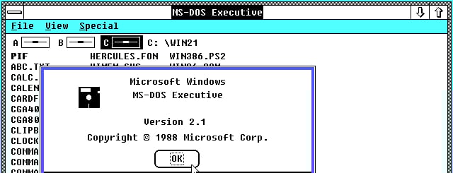 Windows 2.1 released in 1988. Image credits: Microsoft Wiki Fandom
Post-Classical Era (1990–2000)
Post-classical designs represented a slight improvement over classic designs, featuring better color selections, enhanced imagery, and some primary UX refinements such as improved grouping and spacing. Despite these advancements, interfaces remained significantly complex for users.
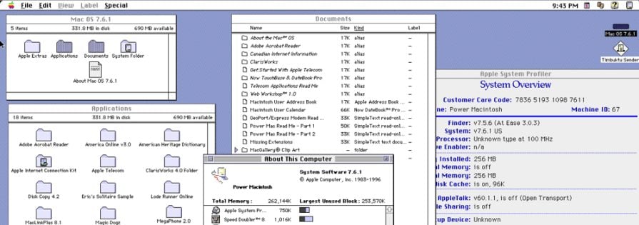 Mac OS 7.6.1 released in 1997. Image credits: Apple Wiki Fandom
Skeuomorphic Era (2000–2010)
During this era, UI/UX designers aimed to make UIs resemble real-world objects. This was achieved using design properties like shadows, gradient-based shading, 3D effects, and glass-like transparent layers (e.g., glassmorphism).
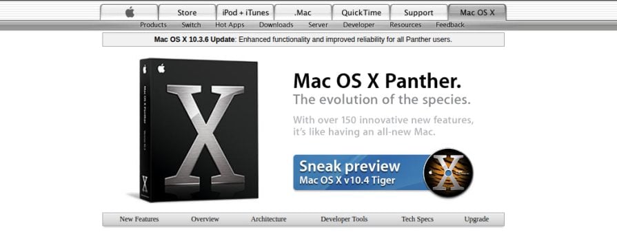 The official Apple website in 2005. Image credits: Wayback Machine
Pre-Modern Era (2010–2015)
Designers began to reduce visual clutter by shedding some major skeuomorphic properties and moving towards flat design. This era also saw significant UX improvements, particularly with better information architecture and a focus on minimalistic design.
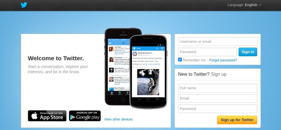 The Twitter homepage in 2013. Image credits: Wayback Machine
Modern Era (2015–Present)
Modern designs are highly optimized and user-centric. UI/UX designers achieved this by fully abandoning skeuomorphic properties and embracing a minimalistic flat design approach.
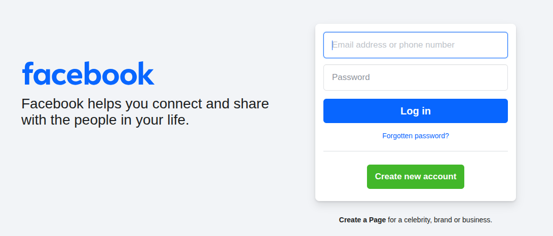 The Facebook homepage in 2025
Why UX Evolution is Essential
While it's technically possible to design any modern digital product using classical, brutalist, or complex designs, such products wouldn't survive in an industry with evolving user expectations and behavior. Each new design era renders older product designs obsolete, necessitating redesigns. However, these evolving eras bring significant benefits for both users and organizations, making UX evolution crucial.
 Over 200k developers and product managers use LogRocket to create better digital experiences. Learn more →
Improves User-Centricity
Usability, user satisfaction, personalization, and overall user experience improve as designers enhance user-centricity. UX evolution in every design era contributes to this by introducing new design concepts and techniques.
For instance, in past UI/UX design eras, UI designers and even developers built product interfaces with less concern for user-centricity, as it wasn't a primary consideration. Today, most companies hire separate UI and UX designers and reduce developer involvement in UX through well-planned design handoffs to ensure high user-centricity in both UI and UX aspects.
Expands Digitization
Historically, people often harbored fear of technology, possessed lower computer literacy, and technology itself was expensive. Printed manuals accompanied every software product, not only because they were geared towards professionals, but also due to the learnability and other UX design issues prevalent in early software UIs. Digital products from early design eras were neither easy to learn nor featured friendly, personalized interfaces.
UX evolution gradually simplifies and enhances the effectiveness of digital products by boosting user-centricity, learnability, and usability, while reducing excessive user interaction. As a result, digitization has expanded, with individuals and large companies alike embracing digital products, making them accessible to everyone regardless of age, physical abilities, or computer skills.
Encourages UI/UX Innovation
Tooltips, popups, auto-completes, accordions, step-by-step forms, in-app product intros, infinite scroll, and skeleton loading are all remarkable innovations introduced by UI/UX designers across different design eras. These impressive UI/UX concepts would never have emerged if the field had remained stagnant in the classical design era.
UI/UX evolution encourages designers to think beyond the present, experiment, and build new design eras with enhanced UX concepts and implementations.
Predictions for the UI/UX Era
While predicting the exact future of UI/UX design solely based on the modern era is challenging, we can confidently make some predictions by evaluating current design trends in major tech companies and modern products.
Hyperminimalistic Design
Minimalism involves having fewer elements within the design space. The degree of minimalism can vary; one designer might achieve it by reducing 55% of elements in a complex product, while another might reduce 45% and still consider it minimalistic. With evolving technologies like AI and HCI, we can reduce visual segments and clutter to the lowest possible level, optimizing usability.
Hyperminimalism takes this to the extreme, aiming for the absolute fewest possible visual segments. In hyperminimalistic designs, users see precisely what they need and expect from a product at a specific moment, with these key characteristics:
- The Fewest UI Elements: Reducing elements, either statically or dynamically through personalization, to the absolute minimum to achieve extreme minimalism.
- Hyper-optimized User Interaction: Utilizing the fewest possible user interactions to maximize productivity, leveraging AI and evolved UI/UX principles.
- Optimal Use of Hardware Features: Employing futuristic hardware components and device features to bypass excessive interactions. Examples include hovering over touch screens to activate features, using gestures or sensors, utilizing microphones, or drawing patterns to reduce typing.
- Low Imagery and No Aesthetics: Incorporating imagery only when it significantly improves UX factors and avoiding excessive aesthetics such as textures, animations, or purely graphical objects.
Examples
While complete, future hyperminimalism isn't fully realized in modern products, we can observe hyperminimalistic design properties in several popular applications.
Every Google product, for instance, reduces excessive visual clutter and enhances user productivity by lowering cognitive load through hyperminimalistic design elements.
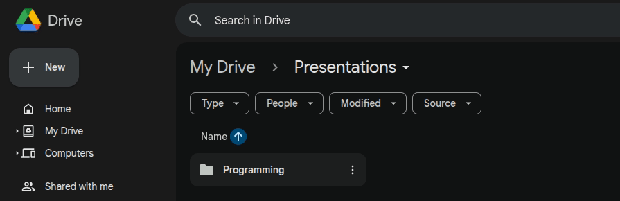 Google Drive reduces initial UI elements and dynamically toggles them only when needed to achieve hyperminimalist properties.
Medium is renowned for its modern, minimalistic design. Its public homepage, despite having only three major screen segments, effectively attracts visitors and offers easy navigation, demonstrating hyperminimalism.
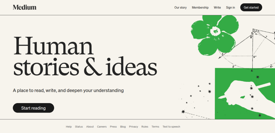 Medium implements a hyperminimalistic yet highly effective design for onboarding visitors.
Ubuntu’s file manager app, Nautilus, utilizes a more hyperminimalistic design compared to file managers in other popular operating systems.
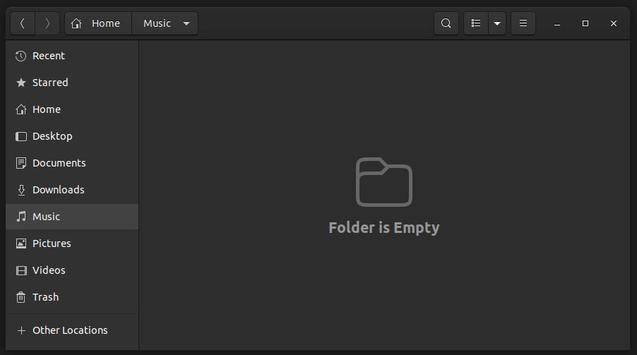 Ubuntu’s file manager app, Nautilus, uses hyperminimalistic design properties.
The Future of UI/UX Design Under Hyperminimalism
Under hyperminimalism, product designers will constantly strive to optimize visual segments and interaction points to minimize UI complexity. Achieving hyperminimalism without sacrificing essential features or visual elements can be challenging, leading to the emergence of new technologies like intelligent touch screens and UX-focused sensors to assist designers.
A potential hyperminimalistic design era will place a strong emphasis on optimizing UI and Interaction Design (IxD) through deep UX research.
Maximinimalistic Design
Pure minimalism reduces visual clutter, but it can sometimes make a design feel neutral. Maximalism is energetic but can be overly visually striking. What if we could create simple designs with an energetic theme by combining both minimalistic and maximalist principles?
Maximinimalistic designs blend principles from both minimalism and maximalism to create simple yet energetic digital product interfaces, characterized by:
- Minimalistic Design Foundation: A low element count and few interaction points to offer simplified user interaction with a low cognitive load.
- Maximalistic Design Features: Applying maximalistic features (e.g., bright colors, bold typography, strong imagery, and patterns) on top of a minimalistic foundation to inject energy into the UI without compromising the overall professional quality of digital products.
- Entertainment-Focused Theme: Maximalistic design properties can push maximinimalistic designs beyond traditional professionalism into the realm of entertainment and creativity.
- Entertaining, Personalized, Casual Tone: Maximalistic labels may use direct, personalized, casual, and sometimes entertaining sentences and phrases to add an engaging feel to product usage, often eschewing traditional formal language. For example, "Your shopping cart is a bit lonely" instead of "Your shopping cart is empty."
Examples
While fully maximinimalistic products are not yet pervasive in the digital ecosystem, many AI-powered, advanced technology, and entertainment-focused companies are experimenting with maximinimalistic design features.
The GitHub Copilot landing page, for instance, incorporates neon colors and effects, especially to convey the advanced AI theme of the marketed product.
 Maximinimalistic design properties in the GitHub Copilot landing page header.
Some minimalistic Google designs have slowly begun to adopt maximinimalistic properties. An example is the typing cursor in Google Search’s AI Mode.
 Maximalist design properties used in Google Search’s AI Mode typing cursor.
Pepsi has started integrating more maximinimalist design elements into both its logo and company website, compared to earlier designs, to enhance an energetic feel within a minimalistic framework.
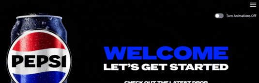 The maximinimalism concept in the new Pepsi website design and logo.
The Future of UI/UX Design Under Maximinimalism
Maximinimalism will help digital products transcend traditional, formal, professional environments to become more energetic, entertaining, and direct by applying maximalistic principles to a minimalistic design foundation. Future digital products could be more personalized and user-friendly through a maximalistic tone. Maximinimalism aims to make technology inviting for everyone by creating an entertaining environment.
A potential maximinimalistic design era will focus on making technology accessible to all by making it entertaining, while also adhering to ethical design concepts.
Fictional Futuristic Design
From a fictional perspective, what would the next futuristic UI entail? Science fiction movies and computer games often visualize futuristic UIs using distinct visual properties that hint at a technologically advanced generation: neon colors, UI elements with sharp or square edges, scientific imagery, and sci-fi animations. In several industries, some science fiction concepts have become reality due to rapid technological evolution. For example, automobile design has begun to resemble what was imagined decades ago, as seen in the Tesla Cybertruck or Jaguar Type 00. Thus, fiction can also become a reality in UI/UX design.
The fictional futuristic design era will draw properties from Graphical User Interfaces (GUIs) in science fiction media to imbue users with a futuristic look and feel, incorporating advanced user interaction features. In such an era, designers will endeavor to let users experience the state of developed technology through UI, characterized by:
- Scientific Shapes, Patterns, and Imagery: Using shapes beyond basic squares, such as chamfered squares or rhombuses for control elements, patterns like hexagonal grids, and scientific imagery to create a futuristic appearance.
- Neon Colors: Establishing a theme for a technologically advanced era with colors like neon green, pink, orange, yellow, and blue. These colors can be bright or faded (as in retro-futurism), depending on design preference.
- Technological Animations: Further enhancing the advanced technological look and feel with sci-fi animations, such as typing effects or flashed fade-ins.
- Futuristic Interaction Design (IxD): Fictional futuristic design may leverage advanced user interaction technology to improve user productivity, usability, and bring users closer to advanced technology through futuristic biotechnological innovations, such as smart digital eye lenses that control GUIs.
Examples
Pure fictional futuristic design remains largely within sci-fi movies and computer games, but some modern digital products have begun to experiment with it.
Most AI agents and chatbots employ a typing effect to reveal new AI-generated concepts, mirroring typing animations in fictional computer devices to evoke a futuristic sensation.
 Sci-fi-like typing effect in ChatGPT.
Companies like xAI, SpaceX, and Tesla utilize fictional futuristic typography, animations, UI elements, and faded neon color selections.
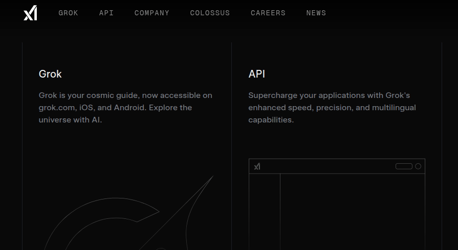 Fictional futuristic design concepts in the xAI website design.
Some Electric Vehicles (EVs) with next-level futuristic designs have started incorporating the fictional futurism concept into their operating system UI designs.
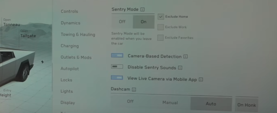 Fictional futuristic design properties in Tesla Cybertruck’s operating system UI. Image credits: A YouTube video.
The Future of UI/UX Design Under Fictional Futuristic Design
In a fictional futuristic design era, what we now imagine as the future, particularly from sci-fi concepts, will become a reality. These designs will aim to visualize and allow users to experience the state of developed, advanced technology through sci-fi design concepts. To further enhance fictional futurism, designers and scientists will collaborate to invent new user interaction mechanisms, with increased investment in biotechnology and AI.
Functional futuristic designs will prioritize making users feel the growth of advanced technology and improving productivity by optimizing user interactions.
What Decides the Characteristics of the Next UI/UX Design Era?
At this stage of the modern design era, product designers are experimenting with new ideas using hyperminimalistic, maximalistic, and sci-fi design concepts. The next UI/UX design era will likely coalesce into a specific philosophy from these predicted ones, influenced by the following major factors affecting the overall design ecosystem:
Technological Innovations
UIs gained color after color screens were invented. The invention of the computer mouse initiated the development of modern pointing-enabled operating systems. Technological innovations fundamentally alter the trajectory of UI/UX evolution. At present, it's challenging to precisely imagine a future Interaction Design (IxD) process without knowing about future innovations that will impact UI/UX design.
The nature of future technological innovations will directly influence the philosophy behind the next UI/UX design era.
UI/UX Innovations
Beyond technological advancements, designers themselves innovate new design concepts and formulate new theories and laws for UI/UX design to better serve users. The evolving UI/UX design field introduces new UI components, user psychology theorems, and general usability design concepts, all based on ongoing experiments and research.
UI/UX innovations that demonstrably enhance usability, productivity, and accessibility will significantly shape the fundamental design principles of the next era.
Design Decisions in Tech Giants
While UI/UX designers have the freedom to create designs based on any philosophy, in practice, most designers utilize popular design systems like Material Design or develop their own design systems/style guides based on concepts adopted by tech giants such as Google, Meta, Netflix, and Apple. Many designers opt to align with the current design trends set by tech giants to foster a consistent product ecosystem for users, enabling them to switch between products effortlessly without needing to learn new interfaces.
The design decisions of tech giants exert a major influence on UI/UX evolution and can directly shape the characteristics of the UI/UX design era.
Overall Design Field Evolution
UI/UX design is a subset of the vast design field, which includes automobile, apparel, building, device, and other product design disciplines. All these subfields evolve synergistically, contributing to the evolution of the entire design landscape. Innovations and new concepts in these related design subfields often influence UI/UX design, as UI/UX designers frequently derive new design concepts from everyday products.
| Real-world object | Related UI/UX element |
|---|---|
| Buttons in machinery and equipment | Button |
| SPDT switch-like real switches | Toggle |
| Slide potentiometer | Slider |
| Old automobile radio buttons | Radio button |
| Checked item in a paper to-do list | Checkbox |
Conclusion
In this article, we explored the evolution of UI/UX design and presented three predictions for the next design era. Many popular digital product designs already incorporate elements from each of these predictions, making it challenging at this stage to definitively guess which design philosophy will dominate the next era.
The next UI/UX design era could be hyperminimalism, maximinimalism, or fictional futurism. Alternatively, it might be a blend of all predicted design philosophies—perhaps a "hypermaximinimalisticfuturism" (though a better name would certainly be needed!).
As designers, we don't need to worry excessively about the next design era. Whatever its form, our collective goal remains to improve the user experience of digital products to better serve users and help organizations grow. We can easily adapt our products for the next era by adhering to fundamental UI/UX design principles and evolving alongside the field.
LogRocket helps you understand how users experience your product without the need to watch hundreds of session replays or talk to dozens of customers.
 LogRocket's Galileo AI watches sessions and understands user feedback for you, automating the most time-intensive parts of your job and giving you more time to focus on great design.
See how design choices, interactions, and issues affect your users — get a demo of LogRocket today.