Vanilla CSS: How 37signals Builds Sophisticated Apps Without Build Tools
Explore 37signals' successful 'no-build' CSS philosophy across Campfire, Writebook, and Fizzy. Discover how they harness modern CSS features like OKLCH, :has(), and CSS Layers to create sophisticated web applications without preprocessors or build tools, proving simpler can be better.
The article delves into 37signals' approach to building sophisticated web applications using only vanilla CSS, completely eschewing preprocessors and build tools. This philosophy, initially highlighted in April 2024 concerning their Campfire application, has consistently been applied to their subsequent products: Writebook and Fizzy. An investigation into these codebases revealed an evolving CSS architecture that progressively adopts modern CSS features while steadfastly maintaining the 'no-build' principle.
These are not minor projects. Campfire is a real-time chat application, Writebook is a publishing platform, and Fizzy is a comprehensive project management tool featuring Kanban boards and complex state management. Combined, these applications represent nearly 14,000 lines of CSS across 105 files, none of which touch a build tool.
The Tailwind Question
The article acknowledges that Tailwind CSS is a valuable tool that accelerates product development, particularly for teams that face challenges with CSS architecture decisions. However, it questions the prevailing notion that utility-first is the only solution, given the dramatic evolution of native CSS. The language, which once necessitated preprocessors for features like variables and nesting, now natively supports:
- Native custom properties (variables)
- Native nesting
- Container queries
- The
:has()selector (finally, a parent selector) - CSS Layers for managing specificity
color-mix()for dynamic color manipulationclamp(),min(),max()for responsive sizing without media queries
37signals recognized this landscape and made a strategic bet on the power of modern CSS, requiring no build step. Three products later, that bet is clearly paying off.
The Architecture: Embarrassingly Simple
Across all three codebases, the CSS architecture reveals a consistently flat structure within app/assets/stylesheets/:
├── _reset.css
├── base.css
├── colors.css
├── utilities.css
├── buttons.css
├── inputs.css
├── [component].css
└── ...
This structure is intentionally simple: no subdirectories, no partials, and no complex import trees. Each file encapsulates a single concept, named intuitively. This approach yields zero configuration, zero build time, and zero waiting. The author suggests that a similar starting structure, including _reset.css, base.css, colors.css, and utilities.css, could greatly benefit new Rails applications, offering much-needed conventions where vanilla CSS often lacks a predefined starting point.
The Color System: Consistent Foundation, Evolving Capabilities
Jason Zimdars' original post effectively explained OKLCH, the perceptually uniform color space used across all three applications. In essence, OKLCH's lightness value directly correlates to perceived brightness, meaning a 50% lightness blue appears as bright as a 50% lightness yellow. This foundational aspect remains identical across the apps:
:root {
  /* Raw LCH values: Lightness, Chroma, Hue */
  --lch-blue: 54% 0.15 255;
  --lch-red: 51% 0.2 31;
  --lch-green: 65% 0.23 142;

  /* Semantic colors built on primitives */
  --color-link: oklch(var(--lch-blue));
  --color-negative: oklch(var(--lch-red));
  --color-positive: oklch(var(--lch-green));
}
Dark mode implementation becomes trivial:
@media (prefers-color-scheme: dark) {
  :root {
    --lch-blue: 72% 0.16 248; /* Lighter, slightly desaturated */
    --lch-red: 74% 0.18 29;
    --lch-green: 75% 0.20 145;
  }
}
Any color referencing these primitives automatically updates, eliminating duplication or separate dark theme files. A single media query transforms the entire application's color scheme. Fizzy further leverages this with color-mix():
.card {
  --card-color: oklch(var(--lch-blue-dark));
  /* Derive an entire color palette from one variable */
  --card-bg: color-mix(in srgb, var(--card-color) 4%, var(--color-canvas));
  --card-text: color-mix(in srgb, var(--card-color) 30%, var(--color-ink));
  --card-border: color-mix(in srgb, var(--card-color) 33%, transparent);
}
This allows for the derivation of a complete, harmonious color palette from a single variable. Changing the --card-color via JavaScript (e.g., element.style.setProperty('--card-color', '...')) automatically updates the entire card's theme, without requiring class swapping or style recalculations.
The Spacing System: Characters, Not Pixels
An unexpected pattern observed across all three applications is the exclusive use of ch units for horizontal spacing:
:root {
  --inline-space: 1ch;  /* Horizontal: one character width */
  --block-space: 1rem;  /* Vertical: one root em */
}

.component {
  padding-inline: var(--inline-space);
  margin-block: var(--block-space);
}
The rationale is that spacing should be relative to content. A 1ch gap between words feels natural because it's literally the width of a character, ensuring proportional scaling with font size. This approach also leads to elegant responsive breakpoints, such as @media (min-width: 100ch), which semantically asks, "is there room for 100 characters of content?" instead of "is this a tablet?"
Utility Classes: Yes, They Still Exist
It's important to clarify that these applications do utilize utility classes. However, the key difference is that these utilities are additive, not foundational. The core styling is defined within semantic component classes, while utilities address exceptions, such as one-off layout adjustments or conditional visibility toggles.
Examples from utilities.css:
.flex { display: flex; }
.gap { gap: var(--inline-space); }
.pad { padding: var(--block-space) var(--inline-space); }
.txt-large { font-size: var(--text-large); }
.hide { display: none; }
This contrasts sharply with a typical Tailwind component's verbose HTML:
<!-- Tailwind approach -->
<button
  class="inline-flex items-center gap-2 px-4 py-2 rounded-full
               border border-gray-300 bg-white text-gray-900
               hover:bg-gray-50 focus:ring-2 focus:ring-blue-500"
>
Save
</button>
The 37signals equivalent is far cleaner:
<!-- Semantic approach -->
<button class="btn">
Save
</button>
With its corresponding CSS:
.btn {
  --btn-padding: 0.5em 1.1em;
  --btn-border-radius: 2em;
  display: inline-flex;
  align-items: center;
  gap: 0.5em;
  padding: var(--btn-padding);
  border-radius: var(--btn-border-radius);
  border: 1px solid var(--color-border);
  background: var(--btn-background, var(--color-canvas));
  color: var(--btn-color, var(--color-ink));
  transition: filter 100ms ease;
}
.btn:hover {
  filter: brightness(0.95);
}
.btn--negative {
  --btn-background: var(--color-negative);
  --btn-color: white;
}
While this approach involves more CSS, it offers significant advantages:
- HTML readability:
class="btn btn--negative"describes what the element is, not how it looks. - Cascading changes: Updating
--btn-paddingonce updates every button. - Composable variants: Adding
.btn--circledoesn't require redefining every property. - Co-located styles: Media queries, dark mode, hover states, and responsive behaviors live with the component they affect.
The :has() Revolution
The :has() selector represents a significant shift, eliminating the long-standing need for JavaScript to style parent elements based on their children. No more.
-
Writebook uses it for a JavaScript-free sidebar toggle:
/* When the hidden checkbox is checked, show the sidebar */ :has(#sidebar-toggle:checked) #sidebar { margin-inline-start: 0; } -
Fizzy applies it to Kanban column layouts:
.card-columns { grid-template-columns: 1fr var(--column-width) 1fr; } /* When any column is expanded, adjust the grid */ .card-columns:has(.cards:not(.is-collapsed)) { grid-template-columns: auto var(--column-width) auto; } -
Campfire employs it for intelligent button styling:
/* Circle buttons when containing only icon + screen reader text */
.btn:where(:has(.for-screen-reader):has(img)) {
  --btn-border-radius: 50%;
  aspect-ratio: 1;
}
/* Highlight when internal checkbox is checked */
.btn:has(input:checked) {
  --btn-background: var(--color-ink);
  --btn-color: var(--color-ink-reversed);
}
This demonstrates CSS natively handling state management, conditional rendering, and parent selection—all declaratively within stylesheets.
Progression
The most fascinating aspect is observing the architectural evolution across 37signals' product releases:
-
Campfire (first release) established the foundation:
- OKLCH colors
- Custom properties for everything
- Character-based spacing
- Flat file organization
- View Transitions API for smooth page changes
-
Writebook (second release) added modern capabilities:
- Container queries for component-level responsiveness
@starting-stylefor entrance animations
-
Fizzy (third release) fully embraced modern CSS:
- CSS Layers (
@layer) for managing specificity color-mix()for dynamic color derivation- Complex
:has()chains replacing JavaScript state
- CSS Layers (
This progression showcases a team continuously learning, experimenting, and shipping progressively more sophisticated CSS with each product. By Fizzy, they are utilizing features many developers may not even be aware of. Fizzy's layer architecture, for instance:
/* Fizzy's layer architecture */
@layer reset, base, components, modules, utilities;

@layer components {
  .btn {
    /* Always lower specificity than utilities */
  }
}

@layer utilities {
  .hide {
    /* Always wins over components */
  }
}
CSS Layers effectively solve the specificity wars that have historically plagued CSS, ensuring that layer order, not file load order or class chaining, determines precedence.
The Loading Spinner
A particularly clever technique appears in all three applications: loading spinners built with no images, SVGs, or JavaScript—just CSS masks. Here's Fizzy’s spinners.css implementation:
@layer components {
  .spinner {
    position: relative;
    &::before {
      --mask: no-repeat radial-gradient(#000 68%, #0000 71%);
      --dot-size: 1.25em;
      -webkit-mask: var(--mask),
        var(--mask),
        var(--mask);
      -webkit-mask-size: 28% 45%;
      animation: submitting 1.3s infinite linear;
      aspect-ratio: 8 / 5;
      background: currentColor;
      content: "";
      inline-size: var(--dot-size);
      inset: 50% 0.25em;
      margin-block: calc((var(--dot-size) / 3) * -1);
      margin-inline: calc((var(--dot-size) / 2) * -1);
      position: absolute;
    }
  }
}
The keyframes reside in a separate animation.css file:
@keyframes submitting {
  0% { -webkit-mask-position: 0% 0%, 50% 0%, 100% 0% }
  12.5% { -webkit-mask-position: 0% 50%, 50% 0%, 100% 0% }
  25% { -webkit-mask-position: 0% 100%, 50% 50%, 100% 0% }
  37.5% { -webkit-mask-position: 0% 100%, 50% 100%, 100% 50% }
  50% { -webkit-mask-position: 0% 100%, 50% 100%, 100% 100% }
  62.5% { -webkit-mask-position: 0% 50%, 50% 100%, 100% 100% }
  75% { -webkit-mask-position: 0% 0%, 50% 50%, 100% 100% }
  87.5% { -webkit-mask-position: 0% 0%, 50% 0%, 100% 50% }
  100% { -webkit-mask-position: 0% 0%, 50% 0%, 100% 0% }
}
This creates three bouncing dots. The background: currentColor property ensures the spinner automatically inherits the text color, making it universally adaptable across any context, theme, or color scheme, without requiring additional assets.
A Better <mark>
Fizzy deviates from the default browser <mark> element's yellow highlighter, instead creating a distinctive hand-drawn circle effect for search result highlighting.
Here is the implementation from circled-text.css:
@layer components {
  .circled-text {
    --circled-color: oklch(var(--lch-blue-dark));
    --circled-padding: -0.5ch;
    background: none;
    color: var(--circled-color);
    position: relative;
    white-space: nowrap;
    span {
      opacity: 0.5;
      mix-blend-mode: multiply;
      @media (prefers-color-scheme: dark) {
        mix-blend-mode: screen;
      }
    }
    span::before,
    span::after {
      border: 2px solid var(--circled-color);
      content: "";
      inset: var(--circled-padding);
      position: absolute;
    }
    span::before {
      border-inline-end: none;
      border-radius: 100% 0 0 75% / 50% 0 0 50%;
      inset-block-start: calc(var(--circled-padding) / 2);
      inset-inline-end: 50%;
    }
    span::after {
      border-inline-start: none;
      border-radius: 0 100% 75% 0 / 0 50% 50% 0;
      inset-inline-start: 30%;
    }
  }
}
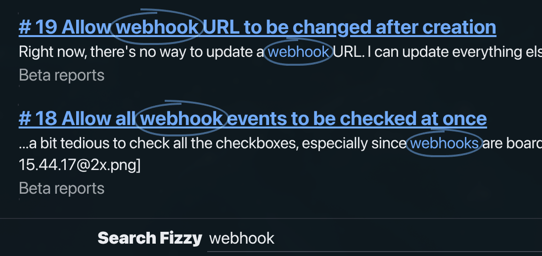
The HTML structure is <mark class="circled-text"><span></span>webhook</mark>. The empty <span> element provides two pseudo-elements (::before and ::after) that draw the left and right halves of the circle. Asymmetric border-radius values create the organic, hand-drawn appearance. mix-blend-mode: multiply makes the circle semi-transparent against the background, switching to screen in dark mode for optimal blending.
Dialog Animations: The New Way
Both Fizzy and Writebook animate native HTML <dialog> elements using @starting-style, a feature that simplifies what was once notoriously difficult. Here's Fizzy's dialog.css implementation:
@layer components {
  :is(.dialog) {
    border: 0;
    opacity: 0;
    transform: scale(0.2);
    transform-origin: top center;
    transition: var(--dialog-duration) allow-discrete;
    transition-property: display, opacity, overlay, transform;
    &::backdrop {
      background-color: var(--color-black);
      opacity: 0;
      transform: scale(1);
      transition: var(--dialog-duration) allow-discrete;
      transition-property: display, opacity, overlay;
    }
    &[open] {
      opacity: 1;
      transform: scale(1);
      &::backdrop {
        opacity: 0.5;
      }
    }
    @starting-style {
      &[open] {
        opacity: 0;
        transform: scale(0.2);
      }
      &[open]::backdrop {
        opacity: 0;
      }
    }
  }
}
The --dialog-duration variable is globally defined as 150ms. The @starting-style rule dictates the animation's starting point when an element appears. Combined with allow-discrete, this enables smooth transitions between display: none and display: block. The modal scales and fades in, with the backdrop fading independently, all driven by pure CSS without JavaScript animation libraries or manual class toggling.
What This Means for You
The article doesn't suggest an immediate abandonment of build tools but encourages a reconsideration of assumptions. It posits that Sass, PostCSS, or even Tailwind might not be necessary for every project, especially if a team possesses sufficient CSS expertise to build a small design system.
While the industry often gravitates towards increasingly complex toolchains, 37signals demonstrates the effectiveness of a simpler approach. While this method may not be suitable for every large team with diverse CSS skill levels (where Tailwind's guardrails could be beneficial), for many projects, 37signals' philosophy serves as a powerful reminder that simplicity can indeed be superior. All code examples in this post are derived from the publicly available source code of Campfire, Writebook, and Fizzy, making these three codebases an exceptional resource for learning modern CSS.